Stuck with a SynthEdit project?

Category: Sub Controls (Page 2 of 4)

DAM V Knob.

Elements of the DAM V Knob.

Hint: This is quite a complex module, so when I’m using it I tend to containerise it, then just connect up the plugs I know I want to use in my project so it’s a bit simpler to connect up and adjust the required settings.
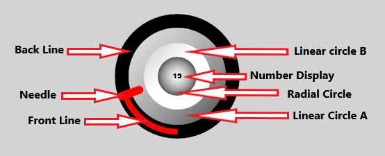
Animation Position: Bi-Directional plug both reports and controls the position of the control knob.
Hint: Help text shown on mouse hover.
Menu Items: Standard right click menu.
Menu Selection: Standard right click menu.
Mouse Down: Set the Bool Value when the mouse is clicked.
Radius: Diameter of the entire control knob.
Gradient Lines OFF/ON: Switches all the lines with gradient settings between single solid colour, and a gradient between two colours. This is a global setting for each control knob.
Note: The lines cannot be switched between solid and gradient individually, the only way you could do this is to set all the lines as “Gradient” and then set the individual line(s) as required with the same Top and Bottom ARGB values.

About the Back Line and Circle gradients.

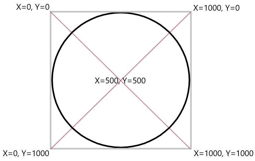
The Back Line X and Y points for both line A and Line B are measured between the top left 0,0, and bottom right of the control 1000, 1000. These values are the same whatever the size of the control, so setting a line to 500, 0 will put A X halfway along the X axis, and the top of the Y axis.
The diagram below shows the positions.

Back Line OFF/ON: Turns the Back Line off and on, this does not affect the Front Line settings.
Back Line Top ARGB: Sets the Line A colour using ARGB.
Back Line Bottom ARGB: Sets the Line B colour using ARGB.
Back Line Size: Sets the width of the Back Line.
Back Line Point A X: About Line and Circle gradients
Back Line Point A Y: About Line and Circle gradients
Back Line Point B X: About Line and Circle gradients
Back Line Point B Y: About Line and Circle gradients
Front Line OFF/ON: Turns the Front Line on and off.
Front Line Top ARGB: Sets the Front Line A colour using ARGB.
Front Line Bottom ARGB: Sets the Front Line B colour using ARGB.
Front Line Size: Sets the size of the Front Line.
Front Line Point A X: About Line and Circle gradients
Front Line Point A Y: About Line and Circle gradients
Front Line Point B Y: About Line and Circle gradients
Start/End Position: Sets the Start and End points of the Front Line specified in degrees from the bottom of the knob, setting 90 will result in a 180 degree travel for the knob. The Start and End points are identical, they cannot be specified individually. Hint: setting Start/End Position to 30 will give you the same amount of rotation as a normal physical control knob.
Limit Min: Sets the lower limit on the output value of the control knob.
Limit Max: Sets the upper limit on the output value of the control knob.
Note: Limit Min and Limit Max also effect the amount of rotation of the control knob. so if you have already restricted this using Start/End Position, these values will change the amount of rotation further.
CTRL Key Modifier: Sets the control precision/rotation speed when the CTRL key is held down.
Fine Tune: Sets the normal precision /speed of rotation.
Mouse Response: Sets how the mouse interacts with the control.
Mouse Hover:
Number displayed: There are various options:
None, no readout on the control at all.
Animation Position, displays the animation position value only.
Number Text, displays the text string sent to the Number Text plug.
Text, displays the text string sent to the Text plug. This is the append/prepend text string so you can add text such as kHz, mS, dB etc.
Animation Pos Append, displays the animation position followed by the string sent to the Text plug.
Number Append, displays the string sent to the Number Text plug, followed by the Text plug string.
Animation Pos Prepend, displays the string sent to the Text plug followed by the Animation position value.
Number Pos Prepend, displays the string sent to the Text plug, followed by the string sent to the Number Text plug
Number Scale: Sets the scale for the number displayed on the control when using Animation Position. This does not affect the output value.
Number Decimal Places: Sets the number of decimal places used for the animation position value displayed.
Font: Sets the font used for the value displayed.
Font Size: Sets the font size for the value displayed.
Font MAC Y Offset: Applies a Y position offset only on MAC computers. Windows PC’s are not affected by this value. This offset is used to compensate for the difference between Windows and MAC display graphics.
Number Position X: Sets the horizontal position of the numeric display on the control knob.
Number Position Y: Sets the vertical position of the numeric display on the control knob.
Linear Circle A OFF/ON: Switches between a graduated and non-graduated fill.
Linear A Circle fill: When set to a non-graduated fill the TOP ARGB is used.
Linear Circle A Top ARGB: Sets the Top ARGB of the graduated circle
Linear Circle A Bottom ARGB: Sets the Bottom ARGB of the graduated circle. Note: The Bottom ARGB is not used in a non-graduated fill.
Linear Circle A Size: Sets the radius of the Linear A Circle.
Linear Circle A Point A X: About Line and Circle gradients
Linear Circle A Point A Y: About Line and Circle gradients
Linear Circle A Point B X: About Line and Circle gradients
Linear Circle A Point B Y: About Line and Circle gradients
Linear Circle B OFF/ON: Switches between a graduated and non-graduated fill
Note: The Bottom ARGB is not used in a non-graduated fill.
Linear Circle B Top ARGB: Sets the Top ARGB of the Graduated Circle.
Linear Circle B Bottom ARGB: Sets the Bottom ARGB of the Graduated Circle.
Linear Circle B Size: Sets the radius of the Linear B Circle.
Linear Circle B Point A X: About Line and Circle gradients
Linear Circle B Point A Y: About Line and Circle gradients
Linear Circle B Point B X: About Line and Circle gradients
Linear Circle B Point B Y: About Line and Circle gradients
Radial Circle OFF/ON: Turns the Radial circle off and on.
Radial Circle Top ARGB: Sets the Top ARGB of the Radial Circle
Radial Circle Bottom ARGB: Sets the Bottom ARGB of the Radial Circle.
Radial Circle Size: Controls the size of the radial circle, as a proportion of the total size of the control knob.
Radial Circle Offset X: Sets the horizontal offset.
Radial Circle Offset Y: Sets the vertical offset.
Radial Circle Radius: Sets the size of the radial circle.
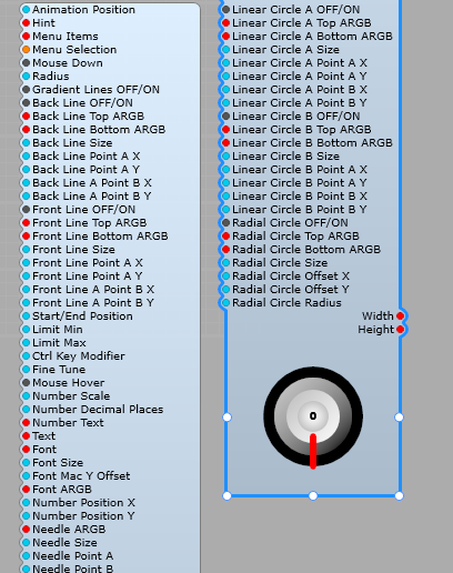
Plugs on the DAM V Knob module

Using the DAM V Knob.

Here is a simple Sub-Control using the DAM V-Knob. You can see here I containerized the V Knob module itself to simplify things, so that we can just have the control plugs most likely to be used in plain view. Having the Control name and value readout below the knob is a personal choice (you can use the built in value display if you like).
I have taken all three value outputs to an IO module to make the control more versatile.
Hint: When making this sub control, start with the largest control knob size you’re going to use, its easier to scale it down than up. If you make a Sub Control, then increase the radius of the knob is will more than likely get cropped. Start with a large knob, then reduce the radius and you’ll have fewer problems.
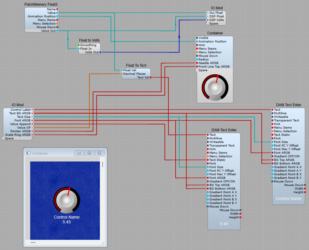
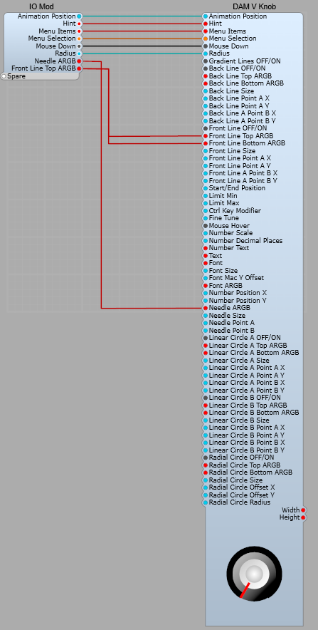
The structure inside the container (Yes, Ok I forgot to rename it) is just the module, but I did this to make the Sub-Control easier to understand (and fit on my screen too!).
DAM V List Block Grid

Using the List Block Grid.

This is a very handy module to replace the drop down List Entry module with.
Instead of the Windows style list we can have rows and columns of buttons.
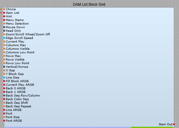
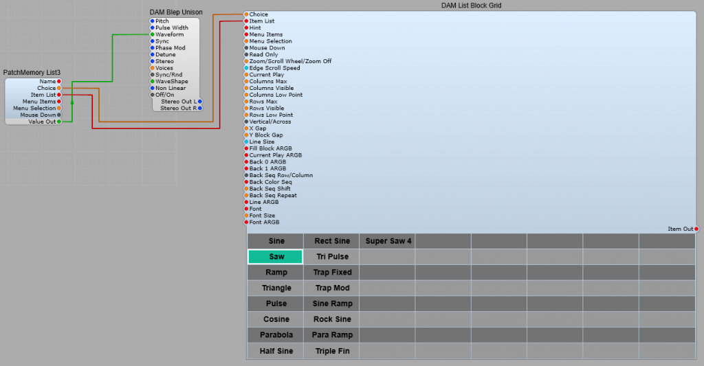
Connecting up the module is simple, see below:

As you can see it’s the usual “hook up” connect to a Patch Memory List3 using the Choice and Item List plugs, the the Value out from the Patch Memory to the DSP module that requires a list selection. As usual there is a default list created from the DSP module via the Patch Memory. So far so good, but all those empty “buttons” aren’t good, and the colours may not match.
The beauty of this module is it’s very customizable, however there are some parts that I found were not immediately obvious without some experimentation. I will do my best to explain these clearly.

First, the Plugs.

Choice: (Integer) Select one of the items in the item list in the drop down list using the items Integer number. Note: The first item in a list is always 0 (Not 1)
Item List: List of items to be included in the list.
Hint: Pop-up hint displayed when the mouse pointer is over the control
Menu Items: List of items in the right click menu.
Menu Selection: Select one of the items in the Menu Item list in the drop down list using the items Integer number. Note: The first item in a list is always 0 (Not 1).
Important Note: Menu Items and Menu list are not the list that is generated by the DSP Module, they are the right click menu!
Mouse Down: Outputs a pulse when the block receives a mouse click,
Read Only: When set to “True” the List Block Grid only receives the selection, it cannot send an output.
Zoom/Scroll Wheel/Zoom Off: Allows use of the mouse wheel to Zoom or Scroll the button grid. Note: When used inside SynthEdit you need to hold down the CTRL + ALT
Edge Scroll Speed: Controls the Zoom /Scroll rate.
Current Play: This button is always the colour set in Current Play ARGB, but this does not affect the List output selection. -1 means no button is made “Current Play”. Note: Button numbers start from 0.
Columns Max: Maximum number of columns available.
Columns Visible: Maximum number of columns visible.
Columns Low Point:
Rows Max: Maximum number of rows available.
Rows Visible: Maximum number of columns visible.
Rows Low Point: If the number of Rows Visible is smaller than the Rows Max value then Rows Low Point sets the point in the list where the list starts displaying.
This is not intuitive so I explain this in more detail later.
Vertical/Across: Sets whether the display of List Items run in a Horizontal or vertical sequence starting from the top left hand corner.
X Gap: Horizontal spacings between buttons.
Y Block Gap: Vertical spacing between buttons.
Line Size: Size in Pixels of the Current PLAY ARGB, and the Line ARGB border lines surrounding the selected button.
Fill Block ARGB: The colour of the selected button. This is your button that changes colour when you have clicked on a choice
Current Play ARGB: The Border colour of a button changes to this colour when the button is clicked, as soon as the left mouse button is released it becomes the selected Line ARGB colour.
Back 0 ARGB: Sets the Row/Column Background 0 colour.
Back1 ARGB: Sets the Row Column Background 1 colour.
Back Seq Row/Column: Sets whether the Back Colours appear as vertical or horizontal stripes.
Note: The sequencing of Row/Column colours is not completely intuitive.
I’ll explain this after explaining all the plug functions.
Back Color Seq: The sequence in which Back 0 ARGB and Back 1 ARGB are displayed. this is in the form of 0 1 0 1 0 1. You must leave a space between each 0 and 1 with no commas or other symbols.
Back Seq Shift: The starting point for the “stripe” sequence.
Back Seq Repeat: How many steps are in the sequence of stripes.
Line ARGB: Border colour of the currently selected item in the list.
Font: Font name. Don’t forget, stick with the default Windows/Mac fonts if you’re releasing your plugin to other people.
Font Size: Text Size in Pixels.
Font ARGB: Text colour.

Using Row/Column Low Point

Say you have a list of 34 Items, and you only want to display 10 of them, to do this you can set Rows Max to 34, and Rows Vis to 10.
So far so good, but at the default Row Low point setting you will see a list that starts with Item 34 (the last one in the list), which may well not be the one you wanted. Fear Not. There’s an answer to this, we use the Low Point setting:
Low Point = 0 the last item of the list will be the bottom button (or right hand) in the button grid.
Low Point = 10 the 11th item from the bottom of the list will be displayed last in the button grid.
Low Point = 20 the 21st item from the bottom of the list will be displayed last in the button grid.

The Back Colour sequencing.

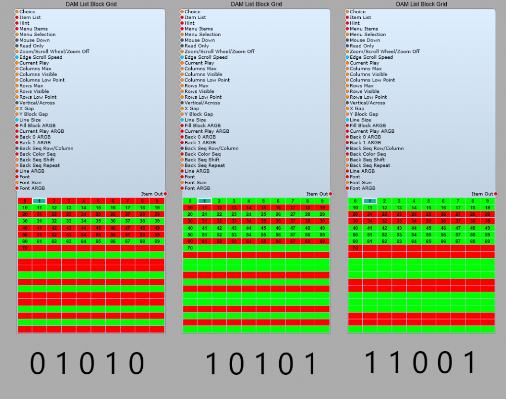
I took a while for me to understand how this sequencing works, one way to do this is with three of the modules set up identically (no need to connect to anything else) as shown below

Demo sequence:
Set Columns Max to 10
Set Columns Visible to 10
Set Rows Max to 20
Set Rows Visible to 20
Set Back 0 ARGB to FFFF0000 (Red)
Set Back 1 ARGB to FF00FF00 (Green)
Now set the Back Color Seq as exactly shown below each module.
Set Back Seq Shift to 0
Set Back Seq Repeat to 5.
You should see the same as I have shown below.
Note: You will find that if you have a 0 at the start of the sequence and a 0 at the end of the sequence (i.e. 0 1 0 1 0) then your colours will start as red green red green red green…so far as expected but at the end we then get a red followed by red, what’s going on? Is this right? well yes it is. If you think about it like below

Sequence 1 Sequence 2

So, If you want to avoid the doubled up colours at the end of the sequence, make it an even number of steps in the sequence. (0 1 0 1 0 1), just make sure you set Seq Repeat to 6. Always have the Seq Repeat value equal to the number of steps in your sequence.

Sequence 1 Sequence 2
RGRGRG RGRGRG
010101 010101

Value display for multiple controls.

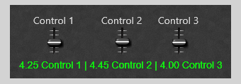
This prefab is a means of taking the values from multiple controls, and combining them into one display. The voltages are converted from DSP volts into GUI text, and combined into a single string for display in a text module, the resulting control panel is shown below. The limiting factor for this application would be how complex you feel the display can be, and still be;
a) Useful and easily read,
b) How complex do you want this structure to be,
c) If you are handling large amounts of text data in this way (DSP to GUI conversion) you could potentially be using up valuable system memory, and slowing the plug-in down.
Note: Due to this works , entering text values to alter the control position/value is not possible, for this reason, to prevent bug reports I have made the display’s Text Entry module non-editable, and would suggest that you do the same.

The unit in action-control panel view.

How to combine multiple voltage values into one text string for display.

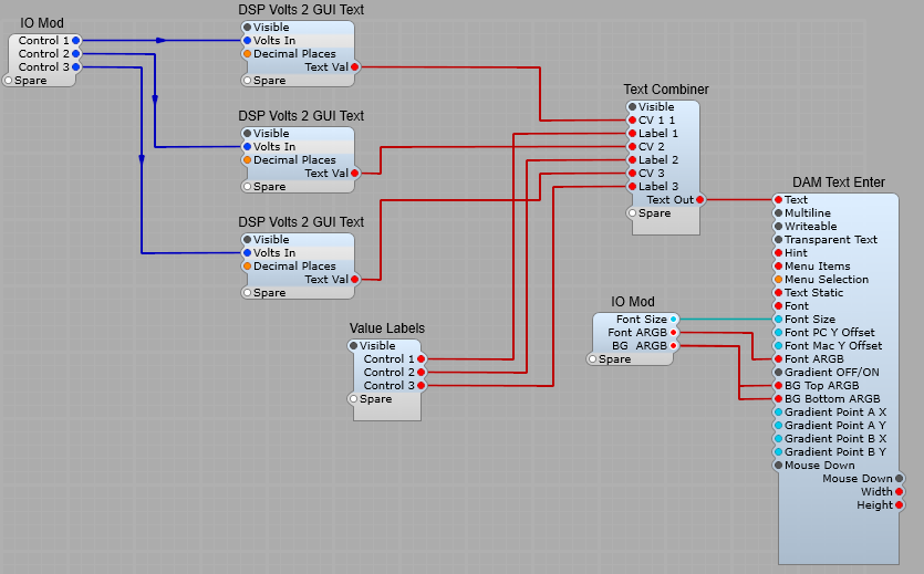
The main container structure is shown below. The principle is to take (in this example) three voltages, and combine them.

Converting DSP Volts to a Text string. (DSP Volts 2 GUI Text)

We have used this before for adding a readout to a slider or knob, so no big surprises here.
Tip: If you fix the number of digits after the decimal point rather than leaving Decimal Places at the default of -1, this stops the display from jumping around as the value changes and the number of digits changes.

Combining the text strings. (Text combiner)

This is where we combine (append) all the text strings into one long string for display, using the ED GUI String Append module (the typo in the module name is Elena’s not mine).

Creating the control name labels. (Value Labels)

I used the structure space, control name, space | space.
The idea is get a structure like so. Where _ is used to indicate a space

_5.5 _Control 1_|_6.6_Control_2_|_5.9_Control 3_
So the first Fixed string will contain;
_Control_1_|_

The Display.

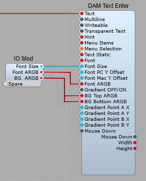
I used Davidson’s DAM Text Enter module as it gives us options for the Font, Font size, Font colour, Background and Foreground colours. Just remember to set the Text Entry to “Non Writeable”.

Making the switch Prefab more versatile.

What can be added to the switch?

The stock Switch Module in SynthEdit is OK, but could it be more versatile?
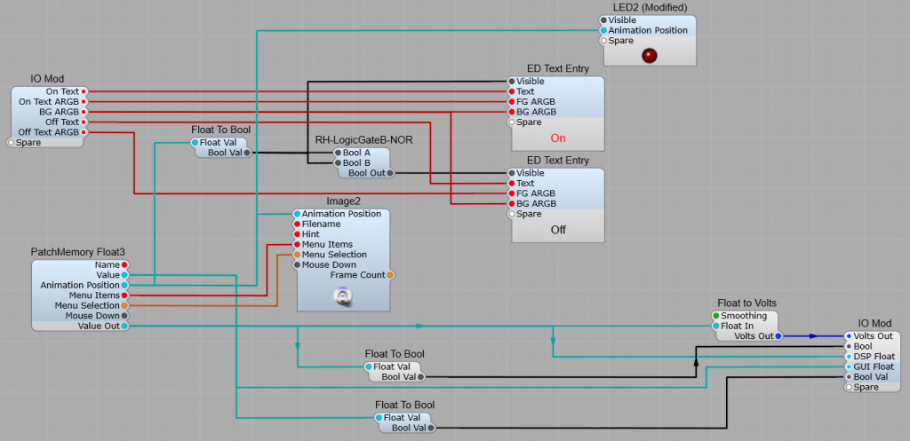
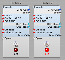
Well yes, we can add more outputs. A switch with a volts output is good as far as it goes, but how about including the obvious Bool output? But then maybe a Float output, a GUI Float output, and a Bool Float output? While we are at it how about an LED On/Off lamp, and Text that changes between the On and Off states?
It’s all quite simple to do using the modules shown below:

Swapping the On/Off text labels.

If you think the RD Text Entry modules look different-it’s because they are containerized so we can hide and show the text labels as required. This is done by switching the Visible Plug from true to false using the RH Logic Gate NOR wired as a Bool inverter fed from the Animation Position via a Float To Bool converter.
Note: You can only perform this “trick” using containers.

Converting the LED to Animation Position.

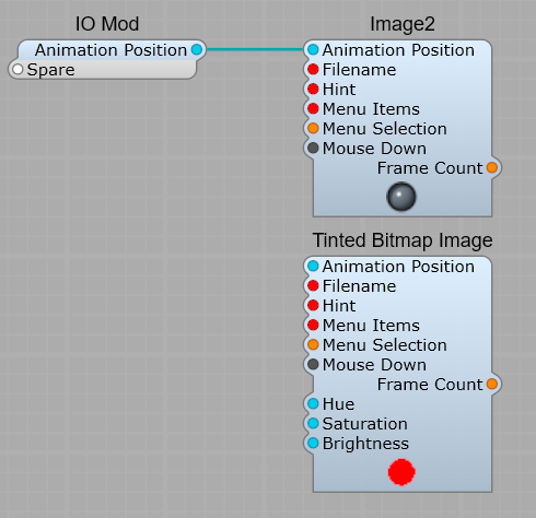
Using the standard LED control would mean using an extra module to Convert Float To Volts from the Volts Out plug on the Patch Memory, so by taking out the Volts To Float converter and the Patch Memory from the LED we can connect it up directly to our existing Patch Memory in the Switch module. Leave the LED containerized as it keeps the Image2 and The Tinted Bitmap Image aligned when you move it.

And below is the final layout. You can set the On and Off text to suit the use of the switch, and the Text colours to suit your colour scheme, withe the text background transparent, or whatever your choice is. Just make sure you get the text carefully aligned in the panel view so it doesn’t “jump”. Tip: while you’re lining the text up disconnect the Input to the RH Logic gate- then both text labels will be visible, and can be aligned easily.

Creating your own slider

Creating a slider control, and making it your own is quite a simple process.
In the example below I have created a slider control that operates more or less like the stock slider.
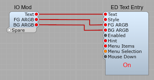
The difference is that by the addition of the two ED Text Entry modules, and a Float to Text module we can make the readout and label for the slider more versatile.
Using the FG ARGB (Text) and BG ARGB (Background) we can change the text and background colours, and even make the background transparent.
The Decimal Places plug controls how many 0’s appear after the decimal point.
-1 gives us a default of 2 DP’s, 0 the obvious 0 DP’s and then with positive integers 2,3,4 DP’s etc.
Make sure that you set the Enabled Plugs on the Label Text Entry module to False, and the Alpha Disabled to 1 to prevent users clicking on the text and editing it.
whether you set the Value Text Entry module to Enabled or Disable depends on whether you prefer not to have the control value editable by clicking on it.

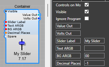
Below is the finished control prefab with both Float and Volts output.
The ARGB values, label, and decimal points can all be set without opening the prefab.

Now is where this control comes into its own. You want to re-arrange the layout so the title of the control is above or to one side? -simply edit the panel view. You want to convert the volts readout to another format? just add some more modules. You wanted red text on a grey text box? again no problem just change the ARGB values.

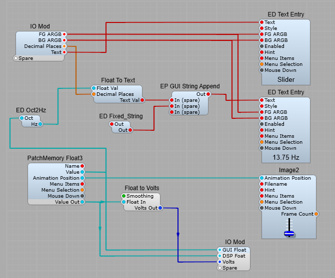
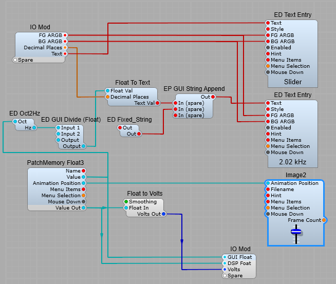
Adding 1V/Octave to Hz conversion for the value.

How many times have you wished that the slider could be made to display the frequency in Hz of a filter or oscillator that’s scaled in 1V/Octave?
This just requires a modification to the display of the slider value. We want to convert from Volts to Hz, then append Hz to the value.
Fortunately Elena Novaretti has once again made the job easier with some handy modules: ED Oct2Hz, ED GUI String Append, and the ED Fixed_String modules.
Just remember when you’re entering Hz into the Fixed String value to put a space before the Hz so there’s a space between the value and the Hz.
Notice that as well as the DSP Float and Volts output, I have now added a GUI Float output as well.

Want to display in kHz? No problem.

Simply add the ED GUI Divide (Float) module, set the value of Input 2 to 1000, and change the fixed text string to read kHz.

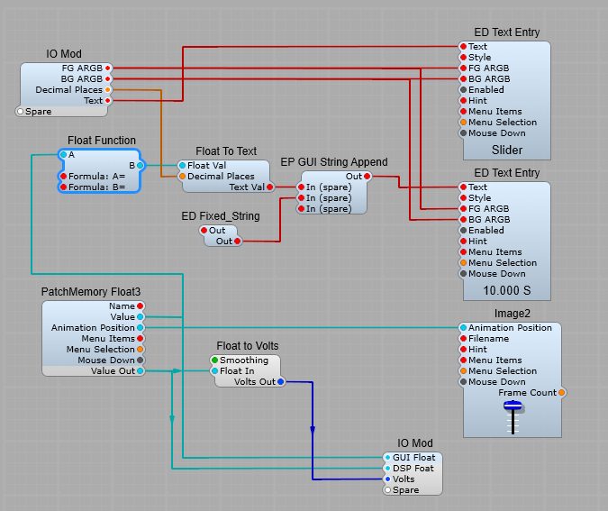
ADSR Time readout for the Slider.

Yes, there is a way of doing this in the old Wizzoo book by David Haupt, but this would involve converting from GUI Float to DSP Float, and then back to GUI float again which would be very wasteful of CPU resources.
Instead we can use a Float Function in the Float to Text conversion process by entering the formula of 10^(Volts*0.4-3) into the Float Function’s Formula: A = Plug properties, and just enter A into the Formula B: = Plug properties
(we aren’t using the B to A direction, only A to B), but something must be in the Formula: B= section for the module to work.
We can use this slider for the Attack, Decay and Release sliders.

ADSR Time readout
Modifying the slider to give a time readout for use with the ADSR2 module.

A dB scaled Level control with readout.


The idea is that a normal control knob (Using Vector, SVG or a regular image) can be connected up to the standard Level Adj module, but the control will behave like a regular dB volume control, and will show the equivalent dB gain in a text entry module.

The GUI value conversion.

The neatest and simplest way to do this uses third party modules. Elena Novaretti has a dB to Volts converter in her module pack, which do the job very nicely.
All we need to do is set the Patch Memory Float3’s Min and Max values to some useful levels such as -40 to + 3, which then gives you a gain range between -40 and +3 dB. I have also used the Name plug set to “dB Gain” to use for the control’s title display module
The only GUI conversion needed is the float to text module for the readout. This is already scaled for our needs.

Adding an ADSR Time readout to a Knob in Synthedit.

This is a question I have seen asked on the Synthedit group, and the Forum, so I thought it would be a useful sub-control & conversion prefab post to save others the hassle of re-inventing the wheel as it were. Whilst it’s a definite advantage in SE, not everyone is a mathematics wizard (including me!)

Converting voltage to time for the ADSR2 module.

The heart of the process of adding a time readout for the Knob is using this small prefab Volts2-ADSR-Time. The conversion takes place in the Waveshaper2B module using the formula (10^(x * 0.4-3))*10 – (note the order of the brackets).
This method is not 100% accurate, but is close enough for our purposes.
once the input Voltage has been converted to the correct curve it’s then converted to a GUI float value, and from there to on converted to a text string, and displayed in the ED Text Entry box. By connecting the second text box to the PatchMemory Float3 module and changing its name to the appropriate Attack/Decay/Sustain label we have a convenient way of adding a control name to the Knob.

You don’t have to use one of the Vector knobs, you can just as easily use the standard sub control Image2 as a control knob.

I have made the prefab available as a download here but as you can see from the screenshots you will need some third party modules, and the vector control is only for V1.5.

Sub Controls – Modifying the Knob

Have you Ever wished that the Moog style Knob control was just a little more versatile? Well it can be and it’s not “rocket science”. If we take the original Knob Sub-control prefab that comes with SynthEdit then its a matter of adding a few extra modules.

With some extra modules (as shown below) we can create a Knob which can be easily re-named, have a value readout, which has a suffix to indicate the type of value (Hz, Volts, dB etc.).
I have used the following ED modules:
GUI String Append, Fixed_string, and Text Entry (I like this module as it’s easy to control the appearance of the text, and set the background to transparent)
We also need to convert DSP Float values to GUI float values for the Hue switching so the QTN Float2GUIFloat is ideal here. The Bool to float modules are used so you can switch the Saturation from colour to mono, and the Brightness from light to dark using a simple tick/untick option.
With some basic maths we can re-scale the voltage to give us readouts such as; Volts->Hz, Volts->kHz, Volts->dB etc.
The switch with the fixed values allows us to easily select a text colour, or by unchecking the colour/mono option just to have black or white text.
The Text and BG (Background) ARGB values are standard, and using 00 for the A value on the BG ARGB setting gives us a fully transparent background.
The string Append module allows us to add mode text after the Float To Text value, so there’s a single space in the Fixed String module, and then the third value is set by you for the appropriate Volts, Hz whatever for the control.
You can also change the number of decimal places that are used for the value readout using an integer value.

The finished control is shown below, and you can download the prefab (for V1.5) from here
Note: You must have the correct 3rd party modules installed!.

How the finished prefab looks

Notes about Sub Controls

Introduction:
Sub controls provide a more customized user interface than standard controls but require more expertise to use effectively. They provide a lower-level access to the various visual elements on your control panel.
There are some basic rules that need to be followed to use them with a minimum of problems.

Controls vs. Sub-Controls- Why have Sub Controls?

Before sub-controls, SynthEdit provided only pre-made controls, like the Slider Control. To understand sub-controls, it’s useful to understand how a control works.

For example the Slider:
A slider has several interacting components…
Lets have a look at the custom made slider below. The original SE slider control is included as a comparison (this control cannot be opened up-it’s one of the old ones, (so it can’t be modified without C++ coding).

Moving the slider updates the numeric text readout and vice-versa. So there’s a bi-directional connection between the two sub-components.
Your computer typically updates its graphics 60 times per second yet the output of the is at audio-rate signal (typically 44,100 or more samples per second). So it follows that there’s a rate-conversion happening inside this module.
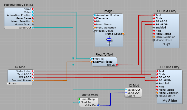
You can’t open up the original slider to see what’s going on inside, but here’s one I put together to demonstrate what goes on:

The current position of the slider is stored in the patch-memory, and the slider will move automatically to reflect the current patch. We need to find a way of displaying the output value of the control. That’s done with the Float to Text, and the ED Text Entry modules.
The Output from the module can take various forms. Here I have included three types of data that I think I’ll find useful:
1) DSP Volts out, 2) DSP Floating Point out, and 3) GUI Floating Point out.
So you can already see how we can “personalize” and add functions to our controls in this way..

The focal point is the Patch Memory module. This handles the communication between the graphical (GUI) elements (with blue backgrounds) and the audio-processing (DSP) elements (with grey backgrounds).
The Patch Memory module also handles any MIDI Automation of the control and handles switching between any presets (patches).

With the traditional Slider the layout of the elements was fixed. There’s no way, say, to put the numeric readout at the top. But now I have this Sub Control slider I can move the elements around at will. However using the Sub Control I just created then I can modify and move elements around as I like.

Moving the elements of the Sub Control around

The purpose behind Sub-Controls.

The purpose of sub-controls is to split up the control into its constituent parts. As you saw with the slider Sub Control, this is a way of giving far you more flexibility over the appearance of your controls.

The first and focal point is the Patch Memory module. It handles the communication between the graphical elements (on the left with blue backgrounds) and the audio-processing elements (on the right with grey backgrounds). The patch mem module also handles any MIDI Automation of the control and handles switching between presets (patches).
The second type of module here is the graphics controls. The Bitmap Image and the Text entry boxes. These accept user input and display the control’s current value. Graphical elements use the Patch-Mem module as a ‘hub’. Input to any object is reflected back to the others, keeping them always in sync.
The third type of module here is datatype conversion. For example the Text-to-Float module. It’s purpose is to bridge the Patch-Mem module’s numeric (float) value with the Text-entry module (which otherwise would be used perhaps for entering a file-name).

You can see from the arrow heads in the picture below that the GUI Floating Point pins (blue background) are bi-directional. This ties in with the expected behavior.

Bi directional GUI data flow

Updating the numeric-entry box moves the knob and vice-versa. These signals are not sampled like audio signals but are event-driven. Event driven means that the control only sends data and uses the CPU when being moved, at all other times it does nothing. Compared to an audio (DSP) signal, the knob thus generates data at a much slower rate, and only when actually needed.

The signal leaves the Patch-Memory module via the Value Out plug as an audio connection, but it’s still sending data at the slower rate generated by the PC’s graphics system. This is why we include the next stage the Float To Volts module.
The Float-to-Volt smooths out, and up-samples our Floating Point data to a true audio-rate signal suitable for controlling SynthEdit’s various audio modules.
In SynthEdit these audio rate signals are called Voltages because SynthEdit is simulating an old-school Voltage controlled Synthesizer.
The Float-to-Volts module gives you control over how smooth the conversion should be. Less smoothing uses less CPU, but the resulting audio changes (especially with filters) may sound ‘stepped’ or ‘zippered’.
There is another reason this module must be included- without it the data rates will be miss-matched and updates in control position lost resulting in jerky or glitchy changes to the audio modules.

The general structure of a Sub-Control patch is:
[Graphical Control]<—>[datatype Converter]<—>[Patch Mem]—>[Audio modules]

Customizing.
You can see that the numeric input is optional, just delete it if you don’t need it. Same with the rotating knob image. Also you can now place the elements however you like.

Some of the settings available and what they do:
Hint:- Provides for ‘Tooltips’, the popup yellow boxes that appear when you mouse-over the control.
Menu Items and Menu Selection:- Provides a context menu (right-click menu). Type the menu items as a comma-separated list. e.g. “Set to Center=1, Randomize”. These will appear on the context menu, along with SynthEdit’s menu entries.
The ‘Menu Selection’ pin outputs the user’s selection as an integer. e.g. if the user clicks ‘Set to Center’ the pin goes to 1. After any selection the pin returns quickly to zero. Always number your item list from 1 otherwise the first item will always output 0 (which is no different from ‘no-selection’).
Editable:- You can use this with Text Entry boxes to stop uses from changing a label by accident, or to prevent values being entered into a control’s value box.
Greyed:- You can use this with a Text Entry box to indicate that control is not currently relevant.

Efficiency.
GUI Modules:
As you know modules with blue backgrounds are ‘GUI Modules’ (Graphical User Interface Modules). These are designed to process user-input (mouse clicks and text entry etc.). These are not intended to process audio signals. On multicore systems they will usually run on a core separate from the audio processing, this allows the audio modules to take priority when the CPU is under load.
Hybrid GUI/DSP modules:
Modules with both blue and grey pins (like the Patch Memory Modules) are hybrid modules. Internally they consist of two parts running simultaneously in separate processes. Communication between the two parts is complex and is thus more CPU intensive than between other modules.

Don’t use audio modules to process GUI signals

In general aim to keep your use of hybrid modules to the absolute minimum.
For example:
Suppose you want to increase a knob’s display to range between 0 and 100, your might think to use the standard Multiplier module. Being an Audio module, this requires an extra conversion via a patch-mem or similar. A much more efficient method is to use a ‘pure‘ GUI solution like the Float-Scaler module.
This will: 1) keep your circuit simpler and 2) your CPU usage far lower.

Use caution with GUI connections into Containers

Sub Controls are only active when the control panel window is open. When you close the control panel, the sub-controls immediately become inactive.
Not only this but GUI plugs communicate only with modules visible in the same window, so if you are passing controls though another container, you must set that containers properties so with the “Controls on Parent” are visible, otherwise the GUI signals will not pass through the container.
This behavior is in support of the new VST3 standards.

Example:- A Knob image is inside a Container, which is connected to a Patch Memory outside the control’s container. Unless the Container is set so that the Panel View is visible the knob cannot not respond to mouse movements and appears ‘frozen’, the Volt Meter and Vector Bar won’t respond to any control movements.

Sending GUI data through a container equals problems
These container settings block the data

However as soon as we change the relevant settings on the Container – Patch Mem the controls spring into life: (see below)

Changing the container settings lets the data through.
The settings that do work.


Note: The structure view will always have this issue, but if the knob’s container has ‘Controls on Parent’ set it will work fine on the Panel view.
The reason is:- With ‘Control on Parent’ set, the knob is displayed on it’s parent container’s window, which the same container the PatchMem is in.
This is confusing- So if possible, always keep your GUI connections within the same container. If you do need GUI connections into a container, you can often get the structure view working too…
For this the container’s ‘Show on Module’ needs to be set. This makes the knob visible in the same window as the Patch Mem which means the data connection works, but there’s still a catch. The right-hand window’s knob still won’t work properly. As it’s effectively a sub-container. There’s no way you can get the Patch Memory module visible in that window.

Summary: Sub controls in a container will work fine on the Panel view provided the container has ‘Show on Parent’ set.
They control may not always respond in the structure view but you can often
(but not always) fix the problem with the ‘Show on Module’ setting.

GUI modules need to be seen

Sub Controls function only while their Container’s Panel is open. i.e. if you close you synth’s panel, those sub controls become inactive.
Therefore never rely on GUI modules to process audio signals. The exception is hybrid modules (Patch Memory) which will continue to provide patch-selection and automation functions via their audio pins.

Avoid splitters
Due to a design mistake, SynthEdit 1.0 had the Container’s ‘Control on Parent’ pin on the wrong side. This made it impossible to connect it to a Patch Mem module (needed for save/recall of paged panel settings).
The ‘Bool Splitter’ was introduced to fix this problem, but the bool splitter causes problems of it’s own. The bool splitter ‘reflects’ any one input signal back out it’s other inputs, this is a bad design because it is not clear which module is in control of the others. The result is modules ‘fighting’ each other for control. Symptoms include ‘flakey’ inconsistent behavior and patches not saved/recalled correctly.
3rd party module developers have sometimes copied SynthEdit’s example and released modules that rely on the use of splitters. This is not their fault, however if at all possible avoid using splitters.

Prefabs worth studying.
SynthEdit’s Insert/Controls menu has several good examples. The Joystick module shows how to make any type of horizontal slider, vertical slider, or two-axis Joystick. Hint: For Sliders – use the resize handles to restrict the area of movement to a narrow strip.

Visual Indicators.
The LED2 prefab is a template for any type of indicator or meter. Notable is it’s clever use of a transparent overlay image to dim the light, and the use of the Tinted Image module to provide for any color light.

Making a Center return slider in SynthEdit.

This is a handy little prefab, that’s easy to make. It’s useful if you have a slider with the range of -10 V to + 10 V, it can be fiddly finding the 0 V “null point” with the standard slider.

How the center return slider works.

The control works by having a button or other clickable item send a Mouse Down signal to a Spring module, which then sends a reset value of 0 volts to the Patch Memory, and the Image 2 slider control.

We need to make up the structure below inside a container.
When we change the Image2 filename to “vslider_med.png” this will automatically load the instructions for how the control should behave, so leave this property setting as “Auto”. Likewise with the Image2 that has “button.bmp” loaded.
By connecting the Mouse Down plug of Text Entry4 to the PatchMemory Float3 if we click on this text label it will also reset the control to 0 Volts.
You should untick the Text Entry4’s writeable property so that it can’t be edited from the panel (it keeps it’s mouse down control output though).
All we need to do is set the Reset Value for the Spring module to 0, the the prefab is completed ready to save and use
The maximum and Minimum slider values can be set as normal in the Prefab properties panel when in use in SynthEdit.
Note: Do not try and make the slider return to 0 V “on click” by connecting the Mouse Down plug for the slider control… it won’t work like that. As soon as you move the slider it will send a Mouse Down to the Spring, and as soon as you release the control it will snap back to 0 V.

« Older posts Newer posts »