This module allows you to send commands to modules such as the Patch Info module. Sometimes you don’t want to use a popup menu to select the Pact Command options, it would be far more convenient to use momentary push buttons. This module allows you to do just that. The PatchInfo Module has five commands: Patch Copy, Open (Preset), Save As (Preset), Open (Bank), Save As (Bank).
Why not just use buttons? There’s a very good reason for this. When using commands that open new windows or dialog boxes it’s very important to trigger such commands as the user releases the mouse button, otherwise SynthEdit ‘loses’ the mouse and the button remains stuck down.
How the Prefab works.
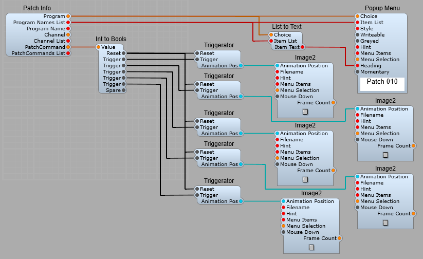
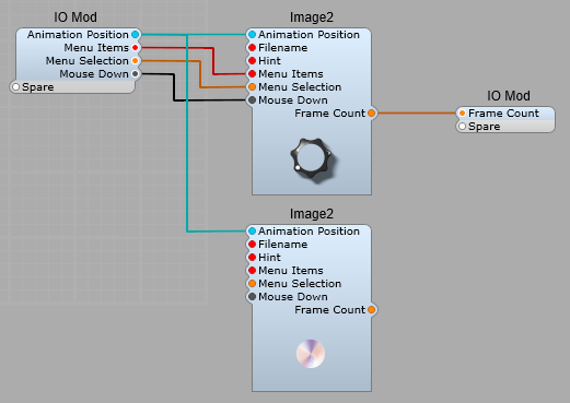
We have five buttons (Image2) connected via Animation Position, to five Triggerators. Important Note: these buttons must be set as clicks or auto in the Mouse Response options, no other settings will work. The Reset outputs are all sent to the first Bool Plug on the Int to Bools module. These are used to reset the button to it’s off state after the selected operation has either been completed or cancelled. Each Trigger input to the Int to Bools module send the appropriate Integer number for the selected command to open its Dialogue Box. Once the operation has been completed the Int to Bools receives the 0 or reset signal from the Patch info module and resets the buttons to their Off state.
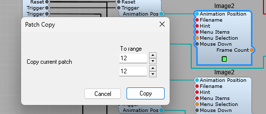
Option 1 (Patch Copy) button clicked. The button stays latched even though it is set up as momentary (clicks). When the Copy or Cancel Button on the dialogue box is clicked, and then released thebutton will revert to it’s off state.
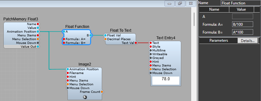
This is a useful GUI module. It saves using conversion from GUI to DSP and back to GUI if you need to use math functions on a GUI float value. It works like the DSP Float Function module, with one notable difference, like most GUI modules it works in both directions. So as well as the A conversion formula, you need to specify the B conversion formula which is the inverse of the A formula; so if the B formula was A*100, then the A formula must be B/100. Note: The A formula is applied to the value received by Plug B and is output from plug A The B formula is applied to the value received by Plug A and is output from plug B. Note: If you only need the conversion to work in one direction, then there is no need to bother with the inverse formula. Note: If either the A or B function is left as an empty string or the value 0, signal flow from that pin will be disabled.
All the frequently used math functions are supported; multiply, divide, add, subtract, power, sin, cos, tan, asin, acos, atan, sinh, cosh, tanh, exp, log, log10, sqrt, floor, ceil, abs, hypot, deg, rad, sgn, min, max.
Example Float function usage.
Suppose you want to have a knob control’s readout display the slider value from 0 to 100, but you want to keep the actual control value in the default 0 to 10 range. This allows you to alter the displayed value, and by using the inverse function we are also allowing the user to enter a value (between 0 and 100) in the text box to change the control knob’s position and output, but still keep the control value inside it’s default range. The formula and it’s inverse can either be entered into the modules properties panel, or supplied as a text string to the appropriate plugs.
How the VU Meter uses Float Function.
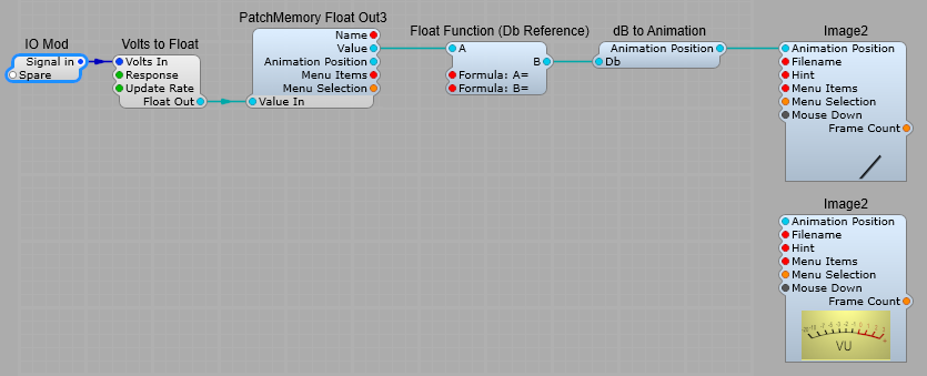
Another use for the GUI Float Function is demonstrated in the VU Meter. We take the Audio input, and feed it into the Volts to Float module where the signal level is converted to floating point at a rate optimised for DSP, which will also give a suitable response time for the meter to be useful (Conversion rate = 60Hz), and the type of response is set to dB VU to suit a VU meter readout. The next step is to use a PatchMemory Float Out3 to convert the data from Audio/DSP to GUI, and to take the value output (not the Animation Position output) and feed it via the Float Function with these values for the Formulae: Formula A= B-18 Formula B= A+18 From here the data is sent via the dB to Animation module to convert the data to fit the scale used for the VU meter, this is where we finally use Animation Position to move the “meter” to the position that matches the Audio input on the VU “scale”. The actual meter we see on the panel uses two Image2 modules. The top one which displays the meter needle is connected to the Animation Position data, and the lower Image has no connections as it’s just the meter scale.
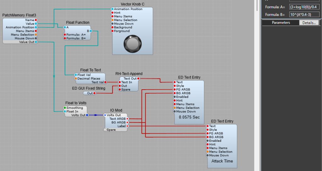
Attack, Decay, and Release time display using Float Function.
We can also use the Float Function to display the Attack, Decay, or Release time of the ADSR modules. The layout below does the job quite neatly. (You could use all stock modules but then you won’t have the text append function, or control over how the Value and Label Text Entry look on the Panel). Applying the math formulae for the conversion. The formula to convert the Volts (or in our case, GUI float, as it’s not yet DSP Volts) to ADSR timing is 10^(A*0.4-3) Because we want to convert the Float Value to ADSR timings the converted value needs to appear on the B Plug, so this is formula B. To convert a text entry to the Float Value for the ADSR timing we need to the inverse of this formula as Formula A which is (3+log10(B))/0.4 Both the Formulae. Formula A is (3+log10(B))/0.4 Formula B is 10^(A*0.4-3) If you study these two formulae carefully you can see just what is meant by an Inverse Formula, we are just working out how to perform the exact reverse of the original math function. (Add becomes subtract, multiply becomes divide and so on. It may seem at first look a bit random, but there is a logical structure in finding the inverse of a math formula…) Having both the A and B formulas allows you to control these times from either the knob or the text entry box.
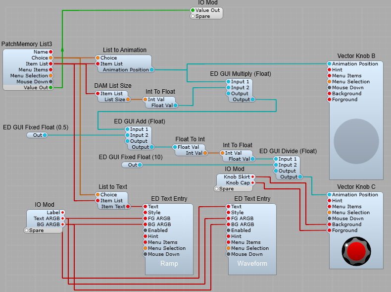
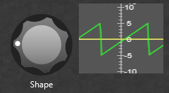
The aim with this project was to create a rotary switch that behaves like a physical rotary switch-having “click stop” positions. This one doesn’t behave like the stock rotary switch if the number of list entries exceeds 10, but continues rotating until the last entry is reached. The waveforms are not shown as a list around the control, but in a text box underneath the control.
Third party modules.
This project requires SynthEdit 1.5 for the Vector knobs, and the following 3rd party modules to operate. Elena Novaretti’s ED modules; RD GUI Multiply (Float), ED GUI Add (Float), ED GUI Multiply. Note:- The ED GUI Fixed Float modules aren’t essential as you can put the values into the modules directly and they are retained. I have used them to make it easier to see what’s going on. Davidson’s DAM modules; DAM List size.
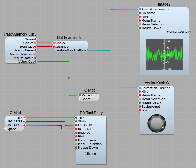
How the rotary switch works.
The basic idea is that Vector Knob B is used to control the Item selection, and via a chain of Math and datatype conversion modules to produce the “Stepped” motion in Vector Knob C. As usual the PatchMemory List3 takes the list of options from the module connected to the Value Out plug, which is then turned into an enumerated list. This is fed to and from the Vector Knob B to select the list option required. DAM List Size is used to output the total number of entries in the list which is used to control the stepping motion of Vector Knob C. The Animation position is fed to the ED GUI Multiply module where it is multiplied by 10, Note: I found that the GUI Add module was needed to add 0.5 to the 0 to 10 float range for the prefab to step through the options correctly, (this seems to be a bug of some sort with the enumeration as without it the last two steps select the same option). The scaled up Animation position is then passed through a GUI Float to Integer, then through a GUI Integer to Float to produce steps of 1 (Brute force Quantizing as there is no GUI Quantizer module). This is then Divided by 10 to produce the correct range of 0 to 1 float for the Animation, but in fixed steps of 0.1 float. Important notes regarding Vector Knobs B and C. There are some specific settings you need to apply to this for the prefab to look, and work correctly; Vector Knob B Background colour ARGB– 55000000, Foreground colour ARGB- 00FFFFFF Arrangement of controls- In panel view the Vector Knob B must be a) Behind Vector Knob C (Right click- Arrange- Move to back), and must be larger than Vector Knob C. I wanted it to look as if Vector Knob C had a transparent “skirt” around it to make it look like one complete control. Vector Knob C- Should be set as “Read Only”, if it’s not the prefab will still work, but you’ll lose the visual “click-stop” effect and just have continuous smooth rotary movement of the switch.
There are two ways to acheive this. 1) Image swapping, using the Choice Integer to select the appropriate image. 2) Using Frames in an image, Animation Position selects the correct image frame.
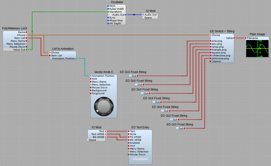
Image file switching.
The first way is to create a series of screenshots from the ‘scope making sure to get the size and framing accurate to prevent “jumping” or “jitter” when swapping the images. The images are then switched as each oscillator waveform is selected. This method requires some third party modules by Eleana Novaretti; ED GUI Fixed String, ED Switch > String.
How the image switching works.
The list of options is taken from the Oscillator module, and converted to an enumerated list composed of ; Choice, a list of Integers from 0 to 6 (the list of options always starts at 0) and Item List, the list of options in text form (each item separated by a comma). List to animation converts the List to Animation position, which is used to select Items from the list. The Integer part of the list is sent to the ED Switch > String, this takes the value from the approproiate ED GUI Fixed String and sends it to the Plain Image module, so as we rotate the knob and select the desired Oscillator waveform, the matching image is displayed.
To create your Images you’ll need some sort of picture editing software to crop them to a uniform shape and size using the ctrl+Print Screen combination, then pasting the screenshot into the photo editor to crop the images and save them.
Swapping images using Frames.
This works by having a single large image in a long vertical strip composed of all the required images, which is interpreted by SynthEdit as “Frames”. A text file is created along with this image file and stored with the file in the default skins folder. So if you name your image file waveforms.png, then you would need to name the textfile as waveforms.txt. An example of waveforms.txt could be; type animated frame_size 120 , 100 mouse_response rotary The line frame_size 120 , 100 is the telling Synthedit the dimensions in pixels each frame of the image file, so here each frame needs to be 120 px wide, and 100 px high. Width is specified first, then height. This needs to be correct to keep the animation of the frames smooth.
The list is taken from the VCO module and converted by the PatchMemory list into an enumerated list, then fed to the List to Animation module which sends the Choice value (as usual starting at 0) to the Vector Knob C (You could use a knob mage with an Image2 module-it’s your choice), and the Image 2 module. The Image2 module interprets the Animation position as a Frame number, and selects the correct section of the large image to display (this is why your image measurements must be correct, and consistent). Note: because the Animation Position data is bi-directional, if the Mouse Response for the Image2 module that displays the images is set to Horizontal or Vertical the mouse can also be used to select the waveform by clicking on the waveform display and dragging in the appropriate direction.
Which method is best?
Frames: Using frames gives the simplest structure to work with, but relies on making up a large composite image using identically sized smaller images. With this method the waveform display can also be used to select the Oscillator waveform. Individual images: Using individual images uses a slightly more complex structure, with carefully sized images, but saves making a large composite image with carefully sized and placed images. With this method it’s not possible to use the mouse with the waveform display to select a new waveform.
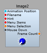
This module is one of the essential foundation blocks of any Sub-Control we would wish to make. It can be used to take an image or a series of frames of an image and use them to make a control such as a slider, a knob, an LED/Lamp, a push button, an indicator, a meter or a switch. The only downside is that the images that can be used being .bmp or .png they are not rescalable. For images to be rescalable they need to be vector of SVG garphics, which are not usable with this module.
The Image 2 module plugs.
Animation Position:- Selects which frame to display, the value of this is normalized between zero and one. Allows for for animating the image, and for generating a control value from this movement. Filename:- Enter the filename of the image (.bmp or .png). Hint: – This text displays as popup yellow tooltip when the mouse hovers over the image. Note: The Hint pin only works for clickable images. So to make the popup hint work for a rotary control, you need to create a basic text file containing – “mouse_response click”, and save it in the default skin folder (you could call it mouse.txt-the name isn’t important though). Menu Items/Menu Selection – Provides a right-click popup context menu for the image. This is commonly used for adding a MIDI-Learn menu. Mouse Down:- Provides a bool “True” signal whenever the mouse is clicked on the image, for the duration of the “click”. Frame Count – Outputs the total number of frames in the image. Used by the Image-To-Frame module.
Properties panel.
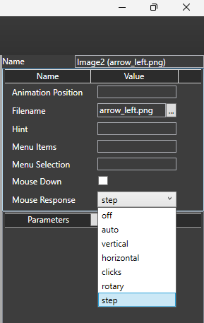
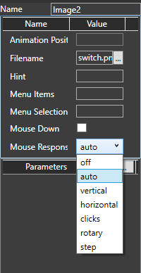
Mouse response allows you to choose how the control interacts with the user: Off- Disabled, no interaction. Hint popup is not available in this mode. Auto- Responds to vertical, horizonal step and rotary modes of operation. The hint popup operates in this mode. Vertical- Only responds to vertical mouse movement. Hint popup is not automatic in this mode. Horizontal- Only responds to horizontal mouse movement. Hint popup is not automatic in this mode. Clicks- Responds to a mouse down event on the the control. The control goes to the 1 position. A button is non-latching in this mode. Rotary- Responds like a rotary control. Hint popup is not automatic in this mode. Step- A rotary control moves in steps of 0.1. A button latches in the on or off position when clicked (depending on it’s current state).
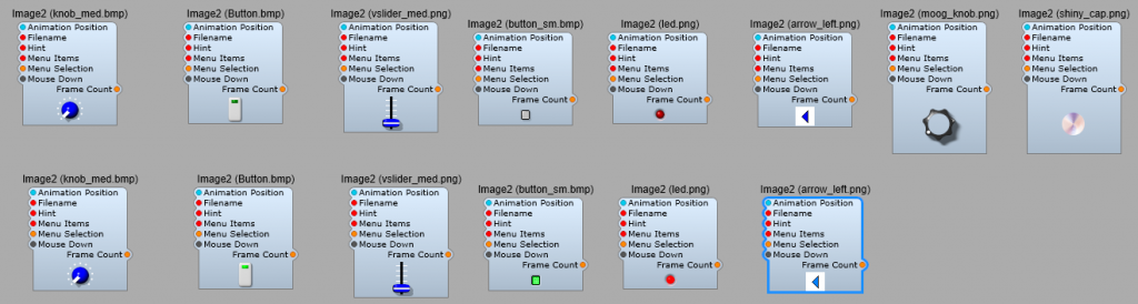
The stock SynthEdit image files.
The file names are shown in brackets after the module name. By deafult these images are located in (For Windows, Not being a MAC user I don’t know their default location) C:\Users\Public\Documents\SynthEdit Projects\skins\default2.
How the image file is animated.
The Bitmap Image sub-control lets you use multiple-frame .bmp or .png images as controls. You have used them and seen them in action but here is a basic overview of what you need to know (as far as a non-programmer).
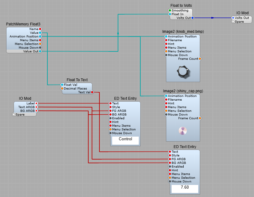
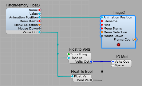
This image is made up of 40 images known as “frames”, which means the animation runs very smoothly. In the skins default folder there is a text file referenced by the Moog control knob, this is the moog_knob.txt file, and this is what it contains: moog_knob.txt type animated (Tells Image2 that the control is meant to move) frame_size 48, 45 (The size of the image file in pixels) mouse_response rotary (The control rotates) padding 13, 7, 13, 4 (The amount of space (padding) to allow round the knob. As the image rotates the position of the knob image is converted to a float value. In the structure in figure below, a PatchMemory Float3 and a Float to Volts converter convert the image’s Animation Position to a voltage output. Any multi-frame image can be used in this way to create visual controls such as buttons, switches, knobs and sliders.
Using the “Moog” Knob.
The two Image2 modules are linked so that the shiny cap will rotate with the knob. Animation position is also fed to the PatchMemory Float3 module, and converted to a DSP signal> this is converted from Float to Volts, any steps or jerkiness is smoothed out, and output at the IO module. Hint: Make sure that both Image2 modules have their Mouse Response properties set the same, otherwise the two different rotations can look a little odd. Hint: Sometimes you will want this control to send information to another GUI external module or prefab. In this case always make a connection from either the Animation position or GUI Value plugs on the IO Module. Don’t waste resources by converting the DSP Voltage back to GUI Float again. Hint: When you connect up a Text Entry module for a label for the control it’s a good move to connect the Text input to an IO module (you won’t have to keep opening up the module to change the label, unlike the stock Moog knob prefab).
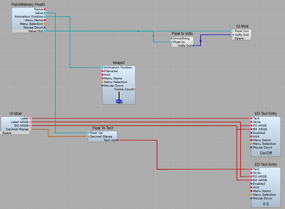
Creating a slider control.
This uses the vslider_med.png image, and the vslider_med.txt information file the contents of which are shown below; type slider frame_size 28, 40 handle_rect 4, 41, 28, 55 handle_range 1, 26 orientation vertical For this control you can leave the mouse response setting as Auto- we don’t want to change this.
Creating a Button type switch control.
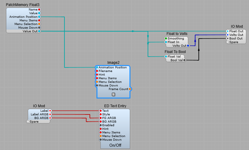
Here the image of a button has just two “frames”, for it’s “on” and “off” states. Click on the ellipsis by the filename box in the properties and find the button.bmp file, and load it into the module. The text file associated is quite simple, and needs no alteration. type animated frame_size 18, 30 mouse_response click. To change the mouse response for our prefab, you can do this from the Image2 properties, go to the MouseResponse List. Auto or Clicks will give you a momentary switch, Step a latching switch. Vertical, Horizontal or Rotary will work, and give you a Latching button, but I would really discourage doing this as it’s going to confuse your VST’s users.
Or you can use button_sm.png
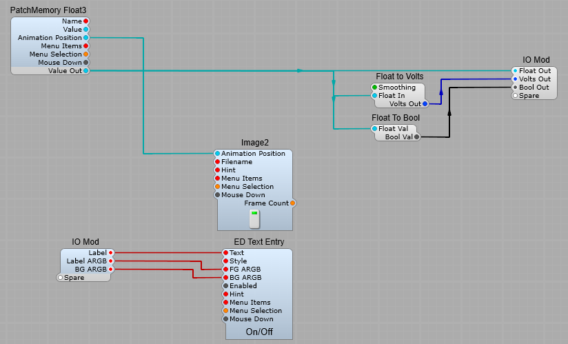
Creating your own On/Off Switch.
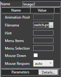
The same principles apply to creating your own on/off switch. Click on the ellipsis by the filename box in the properties and find the switch.png file, and load it into the module.
This is the switch.txt file associated with it (I’m just showing you this for reference)- SynthEdit automatically reads this file. ; medium vertical slider type animated orientation vert frame_size 25, 26 ; extra space at: top, bottom, left, right padding 5, 2, 5, 3 mouse_response stepped You can see it’s quite different (the lines with the semi-colons are just comments-not read or used by SE) from the moog_knob file. For a start the orientation is vertical, not a rotary control, and that extra line at the end mouse-response stepped means that when you click on the control it stays in it’s new state until you click on it again. In this application the Animation position does not change value gradually with control position, it has just an on and an off state, with a float value of 1=on, and 0=off. The observant among you will notice I have connected the LED prefab directly to the Animation Position…but the LED prefab has a DSP Plug. I took out the conversion modules and connected directly to the Image2 module in the LED prefab (saving on un-ncessary DSP-GUI conversions). So we now have a switch with a label and on/off LED indicator.
Hint: So you need a non-latching (momentary) switch? Thats easily done, click on the Image2, and in the properties panel click on the Mouse Response list, and change from Auto, to Clicks. Now your switch won’t stay in the same position, it will “flip” back to it’s default off position.
Hint: If you leave the Mouse Response as Auto then it will use the setting in the associated text file. If you select anything but Auto from the list, this will over-ride the setting in the text file.
Small Illuminated Push-Button.
A simple little prefab that gives a small circular illuminating push button switch. Look for the image file Led.png in the ususal way, and select either clicks for a momentary switch action, or step for a toggled (locking) button.
How to create a “roll your own” customizable Joystick control prefab.
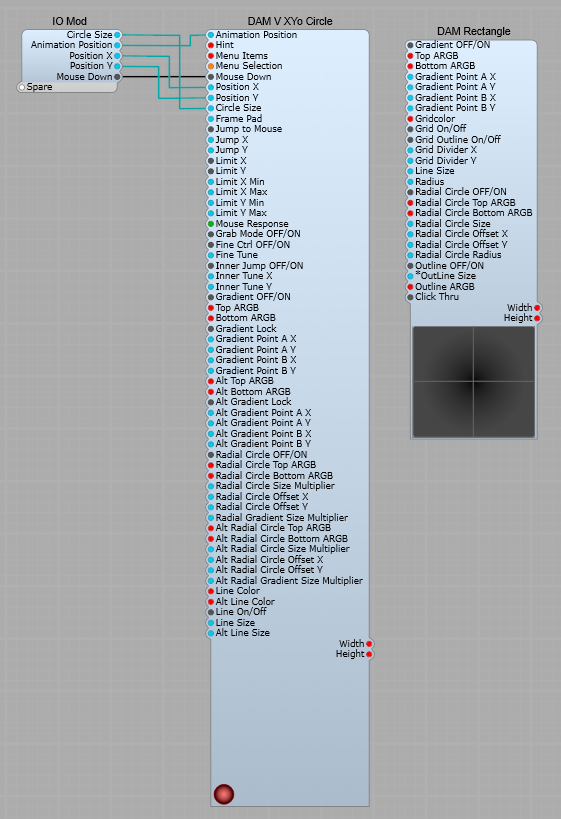
Note: This relies heavily on third party modules: Davidson’s DAM modules; DAM V XYo Circle, DAM Rectangle. Elena’s ED GUI Modules; ED GUI Fixed In, ED GUI Fixed Float, ED GUI Timer.
Once again I’m going to stress that you should never convert from a GUI signal to DSP, perform a math or timing function, then convert this back to a GUI signal. It’s very wasteful on CPU resources, and can cause many problems.
GUI Container for the Joystick.
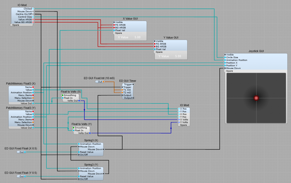
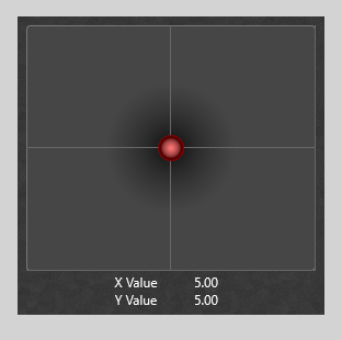
The Joystick control iteslf uses the DAM V XYo Circle module. This resturns the position of the circle, which can be extensively customized. Here I have pre-set it with a red theme. In the interests of simplicity I’m just connecting the following plugs to the IO Module; 1) Animation Position- The output value of this plug is 0 till the circle receives a click (Mouse Down), it then changes to 10. 2) Position X- The X co-ordinate (horizontal) of the circle (Normalized value of 0-1) 3) Position Y- The Y co-ordinate (vertical) of the circle (Normalized value of 0-1) 4) Circle Size- The size in px of the circle.
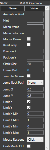
The settings in the properties panel are shown below. Make sure the Jump Back Position List is set as “None”, the Mouse Response is set to “Click”, and The Gradient Lock check boxes are ticked. These are the colour settings I used, but as always that’s your personal choice. Mouse response- This selects various modes, the main ones are; None- Nothing happens when you click on the circle, and it’s locked in position. Click- Click on the circle and the Animation Position changes to 10, the circle assumes its “Alt” colour scheme, and can be moved. Step- Click on the circle and the Animation Position changes to 10, the circle assumes its “Alt” colour scheme and the circle can be moved. The Animation Position value and “Alt” colours are held until a second mouse click is received.
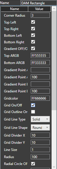
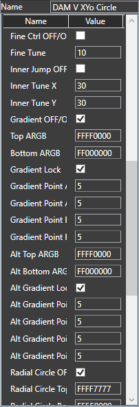
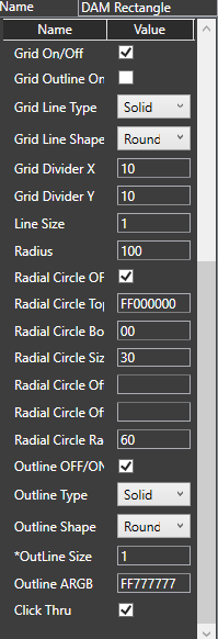
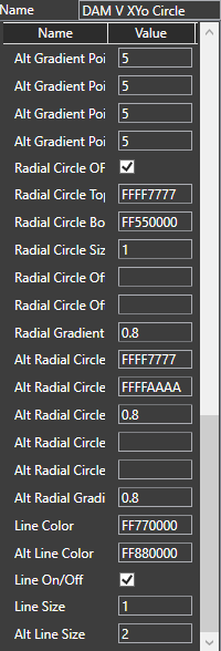
Settings for the DAMV XYo Circle and DAM Rectangle modules.
I have shown these settings as screenshots.
The control section.
The x and y output values are passed as usual to PatchMemory Float3 modules. These then send the Float values to the output IO module as GUI Float, DSP Float and Volts. The Volts as usual is converted by the stock Float to Volts module. Returning the Joystick to the centre position. This is done with a pair of Spring 3 modules to send a value of 0.5 to the Position X and Position Y plugs. The ED GUI Timer is used to send a short (10 mS) pulse to the Spring 3 modules when the Centre On/Off plug is set to true. (I found that the Joystick wasn’t reliably setting to the centre when switched on otherwise). Setting the Joystick’s output ranges. As usual the ranges of the output values can be specified via the Patch Memories. To make this easier I recommend changing the Patch Memory names in the Properties panel to something like x-axis range, and y-axis range.
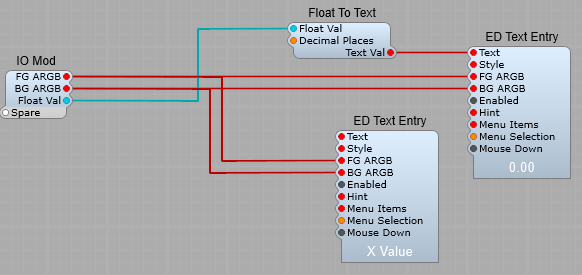
X and Y Value (GUI) containers.
These are just standard Float to Text conversion, both connected to the Value output of the PatchMemories to show the actual value being output by the joystick, rather than the Animation Position.
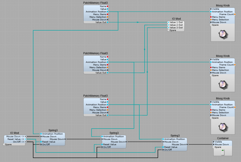
How is it possible to reset three controls from a single button? If we try to link the controls in any way to send a reset value to them from a single source, being Bi-Directional we have immediately linked the controls. There is also the issue that many modules using Animation Position will only allow you to connect one input per module, fortunately the PatchMemory Float3 does allow this, but you still can’t can’t connect all the Controls like this without linking them The answer is to “chain” a number of Spring3 modules, one for each control to be reset. Note: This does not work on the stock controls in the Controls folder, we can only do this by making our own custom knobs or sliders. This must be done (as always) with all GUI modules.
Tip: Give each of the PatchMemory Float3 modules a useful name in the properties, so if you want to adjust the range of the control you know which one you’re adjusting. Note: Changing the range of a control does not affect the Animation Position range. This range is always 0 to 1.
Having the Mouse down output plug on the left side of the Spring3 modules allows for easy chaining of these modules. Being an Animation Position value, the range for the value is 0 to 1. with 0.5 giving a centre position.
Each knob is contstructed as follows, yes, thats’s correct, at this stage there is no patch Memory. This is outside of the control’s container. Two PatchMemories for one control can quickly become a confusing mess.
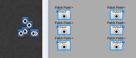
The existing Patch Point modules are fine, but a little basic. If you’re setting up a panel with a large number of patches you need to be very disciplined about labelling and arranging them. As I have found it’s too easy to get in a muddle. As you see below we can start with a nicely laid out pattern of patch points, switch to the panel view…and it’s chaos, and you have to select ech one, then switch to panel view and arrange everything. With some labelling the problem is solved, you can just arrange your panel view in one go.
Making life easier.
What would help is a text label and maybe some colour coding. We can do this fairly easily with a few sub controls. With a little planning we can produce a Patch Bay something like this… even having a few useful things like gain controls and inverters in the patch bay. Note: I’m sorry but the colours are limited to the patch points, there’s no way round this until Jeff introduces (please, please do this Jeff) colour customizable patch leads for the Patch Points. Also the transparency can’t be altered either. Patch cables are only fully visible when you hover the mouse over the patch point. Note: You can plug more than one cable into a Patch Point. Note: To disconnect a cable, right click on the Patch Point itself.
How the patch points are customized.
Not much to say about this really, this is just to point you in the direction of your own style of Patch Points and patch bay. Note: Do pay attention to the Z-order of the modules, otherwise you can end up with a hidden lable or Patch Point! From top layer down you want this order; 1) Patch Point 2) Text 3) The rectangle.
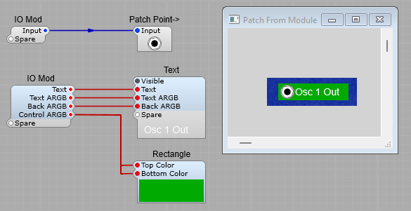
A Patch Point for connection to the Output of a module.
The plugs on the prefab are for controlling the appearance. (Apart from the input/output signals of course). Text: The is the lable next to the patch point Text ARGB: the ARGB colour settings for the label text Back ARGB: The ARGB Colour settings for the background of the text. You’ll most likely want to leave this as 00000000 (Transparent background) Control ARGB: The ARGB colour settings for the Rectangle used as the Patch Point background. Note: If you want rounded corners just go into the properties settings on the panel and adjust them.
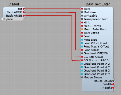
Inside the Text container. This is containerized just to make the structure on this article a little easier to read
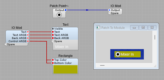
A Patch point for connection to the input of a module.
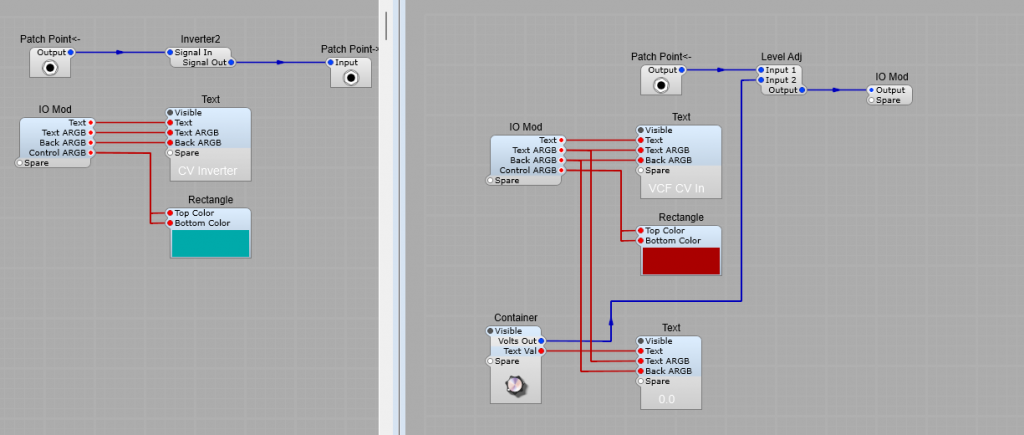
An Inverter patch point, and a gain control patch point. Just for ideas, really all sorts of patch points are possible from now on.
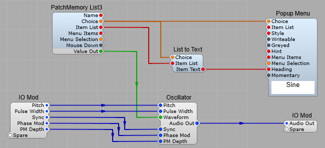
Using a drop down list to select between different control panels.
Using some simple logic , and SynthEdit’s ability to make the control panel of a container visible or hidden, we can easily switch between a variety of different control panels. Using this you could swap between say; 1) a standard oscillator, 2) A Supersaw oscillator, 3) A Casio CZ style phase distortion oscillator, 4) A Sample Oscillator.
The Selector logic.
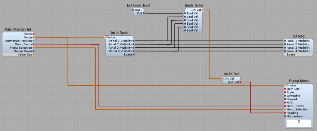
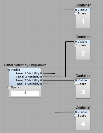
The Popup Menu module should have the following entered into it’s Item List box in the poperties panel 1,2,3,4 (No full stop or comma at the end of the list.) This value is selected from the popup menu, and sent via the PatchMemory Int module to the Int to Bools module. If 1 is selected the Int to Bools module then makes the output I have labelled as Panel 1 Visibility switch to “True”, and if 2 is selected the Int to Bools module then makes the output I have labelled as Panel 2 Visibility switch to “True” and so on. The Bools To Int is used to display the option you have selected in the Popup List. Note: You must have the First Bool Val connected and set to “False” with the ED Fixed_Bool module, otherwise the numbering will go out of sequence. The Int To Text is there to convert the numeric value back to a text string.
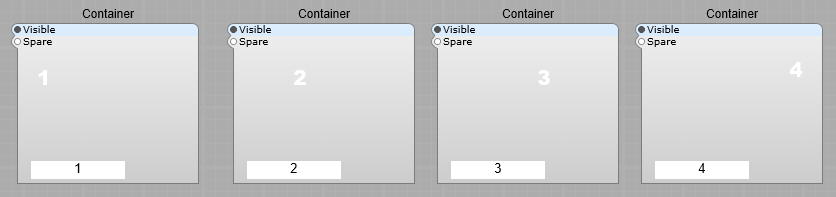
Inside the numbered containers I just put the following to test & demonstrate the sub control
As you select a number in the popup list on the panel, the number displayed will change to reflect your choice.
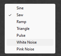
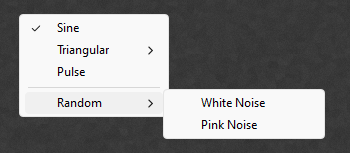
Yes you can, but only for for selecting options using the Many to 1 and 1 to Many flow switches. This is a useful but very poorly documented feature in SynthEdit. It only works when using the stock Popup Menu module, unfortunately the List Entry 4 module does not support this feature. Here is the popup menu we are all familiar with:
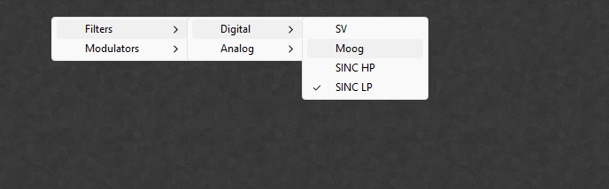
However with a little planning we can have a popup menu like this
The menu syntax
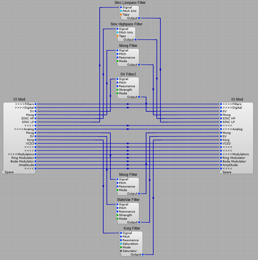
Using this structure below we can have our popup menu, organized into submenus. In this example we would have an arrangement where we switch between the selected modules , which would be kept in the container. As you can see some of the plugs on the switches have these groups of >>>> and <<<< symbols preceeding the text on them. This is the key to our sub menu system; >>>>Filters means “start a submenu called filters <<<< Means “end the submenu. You can add a submenu to a submenu like so; >>>>Filters >>>>Digital Filter 1 Filter 2 Filter 3 <<<< takes you back to the level Filters, to go back to the top menu level, add a second <<<< after the first. To add a spacer into the menu, just insert a —-.(four hyphens)
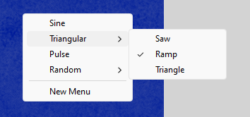
To create the menu below, you would use the following; Sine=0, >>>>Triangular, Saw=2, Ramp=3, Triangle=4, <<<<, Pulse=6, –, >>>>Random, White Noise=9, Pink Noise=10, <<<<, —-, New Menu,
Does the check mark for the selected item annoy or bother you? This can be removed by selecting a checkbox in the properties panel. If you check the “Momentary” option the check mark (tick) is no longer shown.
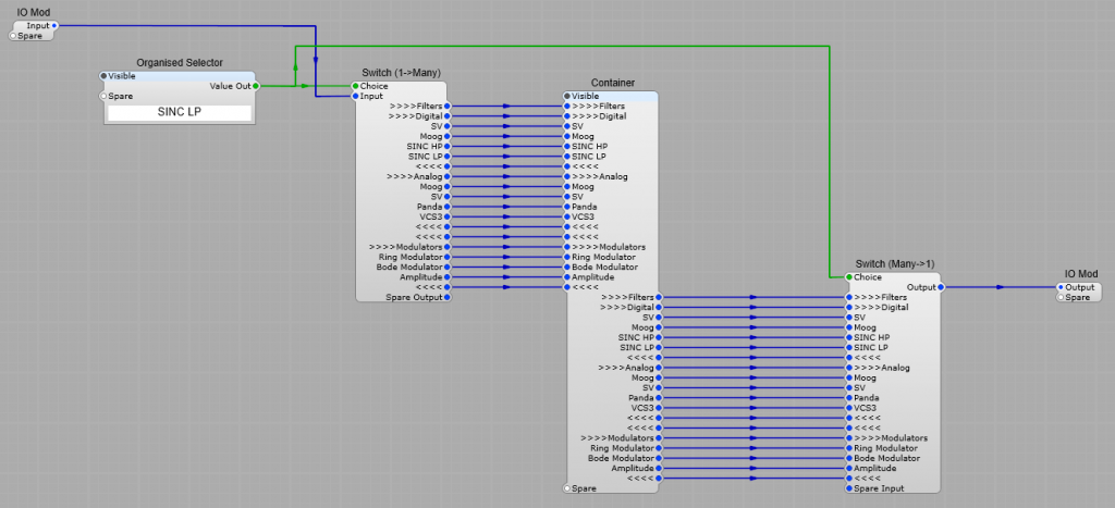
The structure inside the container is below, I have not shown too many modules, just enough to give you the idea. Important note. I have limited the modules shown below to keep things simple. When implementing this yourself please make sure there is a module that has no output such as a voltmeter connected to all the unused Inputs to avoid the “Hanging Modules” issue. Just put the module inside a container, and un-check the visible property so it remains hidden, it doesn’t have to be a Voltmeter, the volt meter module is special because it has no outputs and has a special flag set that tells SE’s “voice watcher” to ignore it. Other similiar modules should work too. . This is important as “dangling wires” can mess with polyphony sometimes.
Sub Menus for Modules with pre-defined Option Lists.
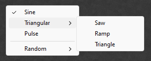
We can also use this with an Oscillator or Filter module. Do not connect the Patch Memory List’s Item List plug to the Popup menu, if you do you won’t get your Submenu system, just the default list of options. The menu system you want to use must be entered into the Popup Menu’s Item List in the properties panel.
Using the following item list will give you the menu shown underneath; Sine=0,>>>>Triangular, Saw=1,Ramp=2,Triangle=3,<<<<, Pulse=4, —- , >>>>Random, White Noise=5, Pink Noise=6, <<<<,