This is a Sub-Control that really is only achievable with third party modules. Both the button , and the text label are clickable. I felt for a control it was useful to have both GUI Float + Bool along with DSP Bool and Volts outputs, which is easily done with a little planning. Note: Purely out of interest this button structure is a good demonstration of the two-way communication between GUI modules- without this the option to have the text as clickable, and changing colour would not be possible.
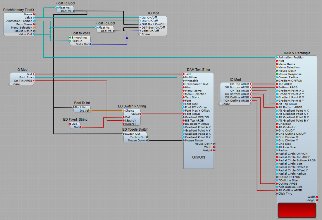
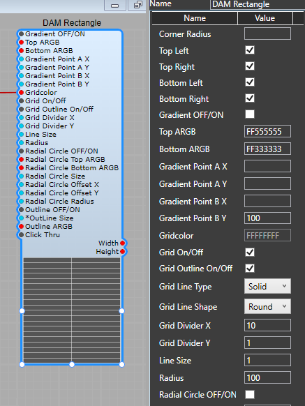
DAM V Rectangle.
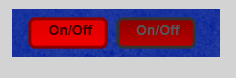
The DAM V Rectangle is connected so as to send a Float value of 1 when the button is clicked, with the mouse response set to the Step option this switches from 0 to 1 on the first click, then from 1 to 0 on the second click and so on. The colour options I felt relevant to this project are connected to an IO module so the user can readily change them.
Mouse Response = Step Gradient Point B (Y) and Alt Gradient Point B (Y) should be set to 50. The colour options are: Top ARGB = Off Top ARGB (Top gradient ARGB colour when button in the OFF state) Bottom ARGB = Off Bottom ARGB (Bottom gradient ARGB colour when button in the OFF state) Alt Top ARGB = On Top ARGB (Top gradient ARGB colour when button in the ON state) Alt Bottom ARGB= On Top ARGB (Bottom gradient ARGB colour when button in the ON state) Outline ARGB = Off Outline ARGB (Button outline ARGB colour when the button is in the OFF state) Alt Outline ARGB = On Outline ARGB (Button outline ARGB colour when the button is in the OFF state)
DAM Text Enter.
The Text Enter module displays the Text on the button which is also clickable. Again some of the options are taken to an IO Module so that the options can be set as required by the user.
Text = The text label that appears on the button. Font Size = The size of the label on the button. Entered as a float value, but goes up in steps of 1 pixel in direct proportion to this value. On Text ARGB = The ARGB value for the text colour when the button is in the ON state. Background colours. These should be preset to an ARGB value of 00000000 (you can just set the first two digits as 00) to give a transparent background for the text. Module Settings: Writable: Un check this box so that when the button is clicked the text box does not change to white, and the text cannot be changed. Font Options: Apart from Font ARGB and Font Size, set these as required for the font type, alignment and styles.
Logic switching.
We need to use a bit of Logic for making the Text Label behave in the same way as the button. Nothing too complex though. ED Toggle Switch. This is used to toggle the Text Label state between on and off rather than it’s default momentary state. It’s connected between the mouse down output on the Text Enter module and the output of the Float To Bool converter. The output of the Float To Bool converter is also connected to the Choice plug of ED Switch > String module. The Switch module selects the ED Fixed_String module with it’s value of FF555555 (a dark grey, or alternatively a value of your own choice) when the Button/Text are in the OFF state, and the option set by the user at the On Text ARGB plug when the Button/Text are in the ON state.
Important Setting.
When you have finished the structure, go to the Panel view, and align the text label over the button where you want it positioned, and make sure you right click the text label and select Arrange > Move To Front. The Z view positioning of the text must be in front of the button.
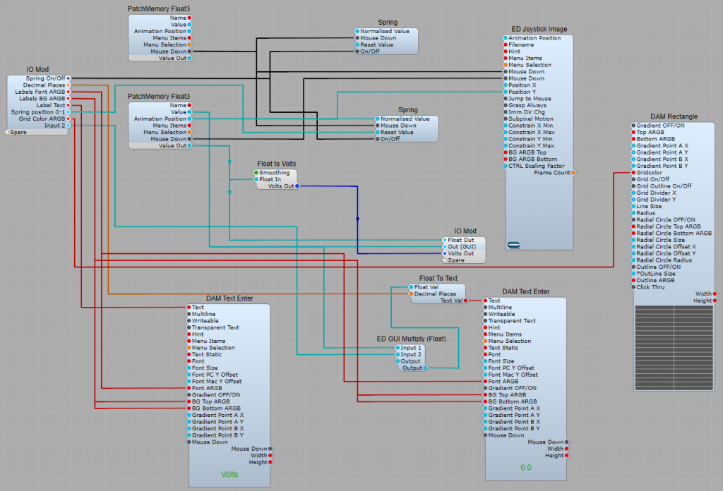
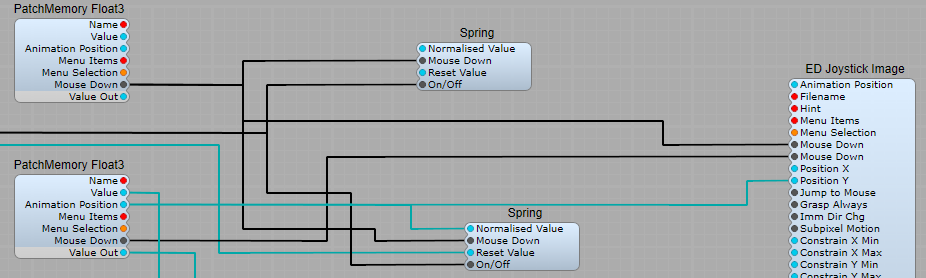
The stock Slider Control in Synthedit has one major disadvantage- It’s not resizable. This project uses third party modules, and can be re-sized by editing its panel view. Note: Resizing the actual slider knob does mean creating a new .png file for it. This control also has the option to “spring” back to a default value, which can be useful, you could use it as a pitch bend slider control for example.
The Joystick/Slider module.
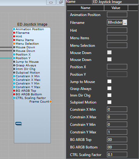
The ED Joystick Image control is used for the slider control itself, there are few properties settings to note, see below:
Setting Constrain X Max to 0 stops any horizontal movement of the control by locking it to the 0 position. Leave the Constrain Y settings as Min=0 and Max=1 as we want the full range. Ctrl Scaling factor sets how fine the control movement is when holding the Ctrl key down and moving the slider. Both the backgrounds are set as 00 for the Alpha (transparency) level so the rest of the ARGB setting can be left blank. The Mouse Down plugs are connected so that the control will be returned to it’s default position when this option is selected.
The control background and scale grid.
The background for the control is supplied by another third party control, the DAM Rectangle, which allows us a resizable background, outline and grid with control over the colours of the background and grid, the settings are shown below. Although I have left the background colour as preset, you could easily link the Top ARGB and Bottom ARGB to allow these as user settings.
The “Spring”.
This is the section that allows us to have a position that the control automatically returns to our user determined default position as soon as the left mouse button is released. Although we have two Spring modules connected only one needs a Reset and normalized value set ( the Y position) Note: Although it seems like only one Spring module is needed this will not work without both connected as shown. The reset value is the position we want the control to return to, and it is the normal GUI float range of 0 to 1, so to return to the mid position a value of 0.5 must be set for the “Spring Position”. This is independent of any values given to the Min Max values for the control, and will always follow this 0 to 1 scale.
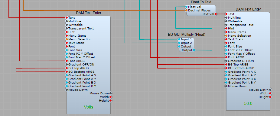
The label and value display.
Another third party module is in use here, the DAM Text Enter module as this gives us greater control over the text formatting than the stock SE text modules. Float to text is used to for the value readout with an ED GUI Multiply (Float) so re can re-scale the readout ( for example you want to convert a range of 0 to 10 to a range of 0 to 100%- this only affects the display, not the Volts/Float outputs.
Output.
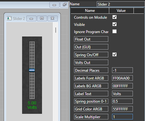
I have Included a GUI Float output, a DSP Float output, and a Volts output. The Float to Volts conversion is set to smooth (30mS).
Resizing the control.
All that need to be done is open the Panel View then drag the relevant controls to their required sizes, then lock and close the panel view. The panel view and control settings are shown below.
@Label: (Text) The text label that appears below the control. (The colour is set by the “Print” ARGB) @ Value: (Text) This is the value or alternative text that replaces @Label when the mouse hovers over the control. (The colour is set by the “Neon” ARGB) @Color: (Text) Controls the colour of the “skirt” and main body of the knob. Cap: (Text) Controls the colour of the cap insert in the centre of the knob. Neon: (Text) Sets the hover colour for the @Value text. Pointer: (Text) Sets the colour of the dot on the body of the knob. Print: (Text) Sets the colour of the scale markings and the @Label text.
Changing the behaviour of the knob.
Shown below are some useful properties settings for the knob: Offset angle: This offsets the starting position of the knob, by changing this to 90 we add 90 degrees to the starting position of the knob. Sweep Angle: By changing this to 180 we can limit the range down from the usual 300 degree control knob sweep, to a180 degrees sweep, or any other range that might be required. Note: This will not change the scale markings! Scale: Adjusts the size of the control knob. Opacity Normal: By setting this to 0 we obtain the behaviour where the @Label text is swapped for the @Value text as the mouse hovers over the control. If the value is left as 1 then only the @Label text will be seen.. Setting the Min/Max Range: This is the same as any other SynthEdit knob or Slider, and is set in the Patch Memory in the Prefab properties panel.
Changing from a continuously variable control to stepped. It’s a simple as changing the Patch memory From Float3 to List 3, and connecting up a module with a list plug, then connecting Choice and Item List plugs. Add a List to Text module to feed the choice to @value and it’s done. The Patch Memory sets it all up for you.
I am maintaining the pages on the SVG controls for those that already have these controls, but sadly Sasha deleted his website and appears to have left the SE community, so they are no longer available (one reason being that they were paid for, not free modules). Whether Sasha will return to the SE community no one knows, as we have been unable to contact him.
Unfortunately I am unable to provide any more assistance with these modules than the basics I have given here. These controls have two main advantages: 1) They can be re-sized with no loss of quality. 2) Highly customizable. The basic set of controls is shown below.
Making the controls your own.
Lots of options here but I would suggest that you create these controls in containers, and link only the plugs you know you will use through IO modules.
The Help Files.
s SVG Control: This is the module on which all the SVG controls can be created. It displays SVG files and makes them interactive by using @commands, and animation Filename: (Text) Supplies the SVG file path. Important Note: If you are finding that when you select a new file name you get a “broken” control that has no image, then your SVG files need to be copied into the Skins/Default folder. Leave the originals in the folders as they are, just copy the folders and their contents. The reason for this is that SE “assumes” that the files will be in the Default Skins folder, and SE offers no way to change this. Animation X/Y: (Floating Point) These plugs send and receive (exactly as the default SE controls) the horizontal (X) and vertical (Y) animation position of the control as a GUI Float value between 0 and 1. Modulation Value: (Floating Point) The input plug for animation modulation. This animates each layer which name contains the “@modulate” command with the modulation value. This must be connect to a Patch Memory Float Out’s Value pin. Input is scaled so that 0-10 corresponds to the default of 0-1. List Choice: (Integer) Sends and receives index value of the selected List Item as with other SynthEdit sub-controls. List Items: (Text) Input for the list of items. Any input other than blank makes module the operate in a stepped mode, a blank input allows for a continuous (un-stepped) movement of the control. A single item input makes the module operate in trigger (on-off) mode. Each list item’s text will replace the “@item” text in the SVG file. Note: For the stepped option to operate correctly there must be the same number of List items as there are list choices. Important: the Integer list for choices must start at 0, not 1 if there are 5 List Items, then the List Choice shall be 0,1,2,3,4. Mouse Down (X/Y): (Boolean) Outputs mouse pressed state. @image: (Text) Supplies the bitmap file path. The Bitmap is displayed on a rectangle in the layer name (in the SVG file) which contains the “@image” command. @label: (Text) Inputs the text string which is used for replacing the “@label” text in the SVG file. @value: (Text) Input to supply the value text. This is used for replacing the “@value” text in the SVG file when the mouse pointer is over the control. Note about Hover: For the @value text to be visible the Opacity Normal value in the s SVG Control’s properties must be set to 0. All Color plugs: How to specify the colours- This is either standard HTML colour names (i.e. Red, Orange, Yellow…), or hex color codes in the following formats: #RGB, #ARGB, #RRGGBB, #AARRGGBB. @color: (Text) Input for the main control colour. Cap: (Text) Input for the colour of the cap on the control knob. Neon: (Text) Input for the hover text colour, and the “slot” for the slider control. Pointer: (Text) Input for the colour of the pointer control knob. Print: (Text) Input for the default text and scale colours. Hint: (Text) Input for hint text (mouse hover) Menu Items: (Text) Input for context menu items Menu Selection: (Integer) Outputs the context menus item index value. Position (X/Y): (Floating Point) Outputs the mouse pointers horizontal (X) and/or vertical (Y) position in the normalized floating point range (0.0 to 1.0) Mouse Over: (Boolean) Outputs the mouse hover state.
Additional settings found in the Properties Panel.
Mode; (Drop down list) 1) Control: Normal operating mode. Module responds to mouse events and animation inputs. 2) Read-Only: Module operates in display mode, useful for LEDs and meters 3) Click-Through: Module will pass all mouse events to modules below. Useful for decorative elements, like glass reflections or coloring of jack inputs/outputs Mouse Precision: This defines the precision of mouse movement in pixels. If zero, precision will be equal to the current @range setting. Fine FactorMouse Precision will be scaled by factor when CTRL key is pressed Jump to Mouse: The Animation Position jumps to the pointer location when the left mouse button is pressed Anim to Choice: If the module is operating as stepped, this sets which axis will be used to control the List Choice by using the animation position (X or Y). Scale: Scales the whole graphic proportionally (1.0 = 100%). Note: values greater than 1 can be used. Angle: This offsets center angle used by the @rotate command. Leave this setting blank to use the default value Sweep Angle: Defines the amount of rotation that is used by the @rotate command (the knob control for example has a setting of 300) which gives the normal amount of rotation, reducing that to 150 give a rotation from 90 degrees to 180 degrees taking 0 degrees to be at the bottom of the control. Opacity: Normal/Hover/Pressed Defines the amount of opacity used by the @show and @hide commands. @show command uses opacity values as they are, while the @hide command subtructs opacity values from 1.0 Note: Hover state is available only in SE 1.5 and above.
The control modules:
Note: The VU meter and PPM meter will only respond to an input signal when the audio engine is running.
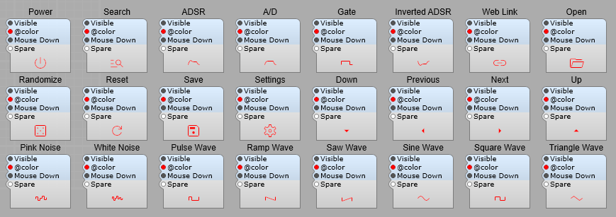
These Icon symbols are also available.
s SVG Control: @commands
Add interactivity and animation to SVG files using @commands. Commands can be issued by naming layers inside a vector graphics editor (i.e. Adobe Illustrator, Figma, Inkscape), or via the id parameter of SVG tags (shape id=”@command”) using a text editor (i.e. Notepad)
Below is the list of the supported commands
Transformation
Add movement to shapes in response to mouse motion
@move: Allows you to move an object horizontally and/or vertically within a specified range. @follow: Makes an object follow the mouse pointer horizontally and/or vertically within a specified range. @scale: Scales an object horizontally and/or vertically in relation to a specified origin point. @flip: Flips an object horizontally and/or vertically in relation to a specified origin point. @rotate: Rotates an object around a specified origin point. The sweep angle is specified in the properties panel. @rotateS: Similar to @rotate, but only the shape will be rotated while its gradient fill will remain static.
Transformation Modifiers
Limit a transformation to a single axis, modulate transformation, or make a shape react in reverse to the mouse movement @X: Limits the object’s transformation to horizontal movement. i.e. @moveX. Not available for rotation. @YLimits the object’s transformation to vertical movement. i.e. @moveY. Not available for rotation. @modulate: Transformation will be modulated by the signal connected to the Modulation Value plug. @reverse: Applies a transformation in the opposite direction to that of the mouse movement.
Transformation Helper Objects
Easily change transformation parameters (origin and/or range) by drawing helper objects. Only their position and/or size will be used to set the parameters, but they will not be displayed in SynthEdit (SE). @origin: Transforms a circle into an origin point for rotation, scale, or flip transformation. If more than one origin point is defined, only the last parsed will be used. If not specified, the center of the module will be used as the origin @range: Transforms a rectangle into a range used by follow or move transformations. If more than one range area is defined, only the last parsed will be used. If not specified, the whole area of the module will be used as the range
Appearance
Change the appearance of shapes fast and easily @color: Changes the color of an object to the one specified in the properties panel. If no layer contains this command, all layers will be recolored. Useful for fast recoloring of icons inside SE. The “@color” field accepts standard CSS color names (i.e Red, Orange, Yellow…) and hex color codes (#RGB, #ARGB, #RRGGBB, #AARRGGBB) @color + (Cap, Neon, Pointer, or Print): Assigns additional colors to the appropriate plugs. This is very useful for making UI color themes @show: Changes the opacity of an object based on the mouse state (normal, hover, and pressed). Opacity values used for each state are specified in the properties panel. If no layer contains this command, all layers will change their opacity in regard to the mouse state @hide: Similar to “@show”, but in reverse
Text
Swap labels or display values inside SE @label: Allows you to easily change a label text in SE via a plug. @value: Allows you to easily change a value text in SE via a pin. @item: Automatically replaces all the “@item” texts to appropriate List Item names. Useful for switches and selectors
Text Modifiers
Modify text alignement. Text is aligned centrally by default @L: Aligns text to the left. i.e. @labelL @R: Aligns text to the right. i.e. @labelLY
Special Objects
Transform simple shapes into objects that are common in audio plugin UI design @image: Transforms a rectangle into an image frame. The image link to a bitmap file is specified in the properties panel. Useful for applying transformations to bitmaps or adding textures to otherwise flat vector shapes @ring: Transforms a circle into a modulation ring track. The sweep angle is specified in the properties panel @ringFill: Transforms a circle into an animated modulation ring fill. @ring: FillBTransforms a circle into an animated bidirectional modulation ring fill.
Sasha, one of the SynthEdit 3rd party module developers has released some new modules which make SVG controls available in SynthEdit. The beauty of these is that they are fully resizable. In this post I’ll show you how to use the SVG Slider control. The structure for my prefab control is shown below, with the prefab control itself shown top right of the diagram.
I have added both Volts and Float DSP output plugs. We can customize the appearance of the slider using the following IO mod plugs: @Color: Sets the colour of the control knob Neon: Sets the colour of the text under the control when the mouse cursor is over the control. Pointer: Sets the colour of the pointer (line) on the slider knob. Print: Sets the colour of the slider scale and the text below the control when the mouse cursor is not over the control. @Label: The label text is the text shown below the control when the mouse cursor is not over the control. If no text is supplied the default of “Value” will be shown. @Value: This is the text shown when the mouse cursor is oven the control. We can use this to provide a display of the current output value of the control. By using the modules as shown below we can create, and customize the value displayed. The float scaler is used to multiply or divide the value to be displayed, the Float T Text converts the float value to text, and allows us to specify how many decimal places will be displayed (The output Volts/Float value is not affected). The s Merge module allows us to add our text of choice after the converted value with a preset separator character (Separator plug value). Multiply: Use to divide or multiply to re-scale the default 0-10 output range for the display (this does not re-scale the output values!) Decimal Places: Allows us to specify how many digits are displayed after the decimal point. Ctrl Key: Holding down the control key whilst adjusting the control allows us to increase the accuracy with which we can adjust the control as with other standard SE controls and sub-controls.
Note: To resize the control it’s not a matter of selecting it and dragging the outline, you can only drag the control to a new position. To resize the slider you must open the prefab and select the s SVG Control module, and then look for scale in the properties panel. To adjust the size of the control this value needs to be adjusted.
This project uses one of the Vector controls created by Davidson. It can be resized and the colours can be changed. There are GUI latching and momentary outputs along with DSP latching and momentary outputs. There are plugs for customizing the text that appears above the button, which also changes when the button is clicked. The structure of the prefab is shown in the diagram below, and the prefab file can be downloaded from here
You will need various third party modules installed for this to work however. The RH-Switch-Text: is needed to switch between the On and Off text labels, and switch their colours. The ED DSP Timer: is required as a bistable for the switch latching. Set to Bistable in the properties panel, no values are needed for T1 and T2 (they will be ignored anyway). QTN Bool2GUIBool: is needed to connect the various GUI switching modules and the ED DSP Timer. ED Text Entry: is not essential, you could us the stock one, but you’ll lose the text and background colour customization! DAM V Circle: 100% Essential, there is no stock equivalent. Notes: i) The prefab container must have its properties set to “visible” ii) The DAM V Circle module should have the mouse response set to step, unless you would rather the buttons just flash as they are clicked.
Shown below is a panel view of two of the switches in operation.
Introduction: Sub controls provide a more customized user interface than standard controls but require more expertise to use effectively. They provide a lower-level access to the various visual elements on your control panel. There are some basic rules that need to be followed to use them with a minimum of problems.
Controls vs. Sub-Controls- Why have Sub Controls?
Before sub-controls, SynthEdit provided only pre-made controls, like the Slider Control. To understand sub-controls, it’s useful to understand how a control works.
For example the Slider: A slider has several interacting components… Lets have a look at the custom made slider below. The original SE slider control is included as a comparison (this control cannot be opened up-it’s one of the old ones, (so it can’t be modified without C++ coding).
Moving the slider updates the numeric text readout and vice-versa. So there’s a bi-directional connection between the two sub-components. Your computer typically updates its graphics 60 times per second yet the output of the is at audio-rate signal (typically 44,100 or more samples per second). So it follows that there’s a rate-conversion happening inside this module. You can’t open up the original slider to see what’s going on inside, but here’s one I put together to demonstrate what goes on:
The current position of the slider is stored in the patch-memory, and the slider will move automatically to reflect the current patch. We need to find a way of displaying the output value of the control. That’s done with the Float to Text, and the ED Text Entry modules. The Output from the module can take various forms. Here I have included three types of data that I think I’ll find useful: 1) DSP Volts out, 2) DSP Floating Point out, and 3) GUI Floating Point out. So you can already see how we can “personalize” and add functions to our controls in this way..
The focal point is the Patch Memory module. This handles the communication between the graphical (GUI) elements (with blue backgrounds) and the audio-processing (DSP) elements (with grey backgrounds). The Patch Memory module also handles any MIDI Automation of the control and handles switching between any presets (patches).
With the traditional Slider the layout of the elements was fixed. There’s no way, say, to put the numeric readout at the top. But now I have this Sub Control slider I can move the elements around at will. However using the Sub Control I just created then I can modify and move elements around as I like.
The purpose behind Sub-Controls.
The purpose of sub-controls is to split up the control into its constituent parts. As you saw with the slider Sub Control, this is a way of giving far you more flexibility over the appearance of your controls.
The first and focal point is the Patch Memory module. It handles the communication between the graphical elements (on the left with blue backgrounds) and the audio-processing elements (on the right with grey backgrounds). The patch mem module also handles any MIDI Automation of the control and handles switching between presets (patches). The second type of module here is the graphics controls. The Bitmap Image and the Text entry boxes. These accept user input and display the control’s current value. Graphical elements use the Patch-Mem module as a ‘hub’. Input to any object is reflected back to the others, keeping them always in sync. The third type of module here is datatype conversion. For example the Text-to-Float module. It’s purpose is to bridge the Patch-Mem module’s numeric (float) value with the Text-entry module (which otherwise would be used perhaps for entering a file-name).
You can see from the arrow heads in the picture below that the GUI Floating Point pins (blue background) are bi-directional. This ties in with the expected behavior.
Updating the numeric-entry box moves the knob and vice-versa. These signals are not sampled like audio signals but are event-driven. Event driven means that the control only sends data and uses the CPU when being moved, at all other times it does nothing. Compared to an audio (DSP) signal, the knob thus generates data at a much slower rate, and only when actually needed.
The signal leaves the Patch-Memory module via the Value Out plug as an audio connection, but it’s still sending data at the slower rate generated by the PC’s graphics system. This is why we include the next stage the Float To Volts module. The Float-to-Volt smooths out, and up-samples our Floating Point data to a true audio-rate signal suitable for controlling SynthEdit’s various audio modules. In SynthEdit these audio rate signals are called Voltages because SynthEdit is simulating an old-school Voltage controlled Synthesizer. The Float-to-Volts module gives you control over how smooth the conversion should be. Less smoothing uses less CPU, but the resulting audio changes (especially with filters) may sound ‘stepped’ or ‘zippered’. There is another reason this module must be included- without it the data rates will be miss-matched and updates in control position lost resulting in jerky or glitchy changes to the audio modules.
The general structure of a Sub-Control patch is: [Graphical Control]<—>[datatype Converter]<—>[Patch Mem]—>[Audio modules]
Customizing. You can see that the numeric input is optional, just delete it if you don’t need it. Same with the rotating knob image. Also you can now place the elements however you like.
Some of the settings available and what they do: Hint:- Provides for ‘Tooltips’, the popup yellow boxes that appear when you mouse-over the control. Menu Items and Menu Selection:- Provides a context menu (right-click menu). Type the menu items as a comma-separated list. e.g. “Set to Center=1, Randomize”. These will appear on the context menu, along with SynthEdit’s menu entries. The ‘Menu Selection’ pin outputs the user’s selection as an integer. e.g. if the user clicks ‘Set to Center’ the pin goes to 1. After any selection the pin returns quickly to zero. Always number your item list from 1 otherwise the first item will always output 0 (which is no different from ‘no-selection’). Editable:- You can use this with Text Entry boxes to stop uses from changing a label by accident, or to prevent values being entered into a control’s value box. Greyed:- You can use this with a Text Entry box to indicate that control is not currently relevant.
Efficiency. GUI Modules: As you know modules with blue backgrounds are ‘GUI Modules’ (Graphical User Interface Modules). These are designed to process user-input (mouse clicks and text entry etc.). These are not intended to process audio signals. On multicore systems they will usually run on a core separate from the audio processing, this allows the audio modules to take priority when the CPU is under load. Hybrid GUI/DSP modules: Modules with both blue and grey pins (like the Patch Memory Modules) are hybrid modules. Internally they consist of two parts running simultaneously in separate processes. Communication between the two parts is complex and is thus more CPU intensive than between other modules.
Don’t use audio modules to process GUI signals
In general aim to keep your use of hybrid modules to the absolute minimum. For example: Suppose you want to increase a knob’s display to range between 0 and 100, your might think to use the standard Multiplier module. Being an Audio module, this requires an extra conversion via a patch-mem or similar. A much more efficient method is to use a ‘pure‘ GUI solution like the Float-Scaler module. This will: 1) keep your circuit simpler and 2) your CPU usage far lower.
Use caution with GUI connections into Containers
Sub Controls are only active when the control panel window is open. When you close the control panel, the sub-controls immediately become inactive. Not only this but GUI plugs communicate only with modules visible in the same window, so if you are passing controls though another container, you must set that containers properties so with the “Controls on Parent” are visible, otherwise the GUI signals will not pass through the container. This behavior is in support of the new VST3 standards.
Example:- A Knob image is inside a Container, which is connected to a Patch Memory outside the control’s container. Unless the Container is set so that the Panel View is visible the knob cannot not respond to mouse movements and appears ‘frozen’, the Volt Meter and Vector Bar won’t respond to any control movements.
However as soon as we change the relevant settings on the Container – Patch Mem the controls spring into life: (see below)
Note: The structure view will always have this issue, but if the knob’s container has ‘Controls on Parent’ set it will work fine on the Panel view. The reason is:- With ‘Control on Parent’ set, the knob is displayed on it’s parent container’s window, which the same container the PatchMem is in. This is confusing- So if possible, always keep your GUI connections within the same container. If you do need GUI connections into a container, you can often get the structure view working too… For this the container’s ‘Show on Module’ needs to be set. This makes the knob visible in the same window as the Patch Mem which means the data connection works, but there’s still a catch. The right-hand window’s knob still won’t work properly. As it’s effectively a sub-container. There’s no way you can get the Patch Memory module visible in that window.
Summary: Sub controls in a container will work fine on the Panel view provided the container has ‘Show on Parent’ set. They control may not always respond in the structure view but you can often (but not always) fix the problem with the ‘Show on Module’ setting.
GUI modules need to be seen
Sub Controls function only while their Container’s Panel is open. i.e. if you close you synth’s panel, those sub controls become inactive. Therefore never rely on GUI modules to process audio signals. The exception is hybrid modules (Patch Memory) which will continue to provide patch-selection and automation functions via their audio pins.
Avoid splitters Due to a design mistake, SynthEdit 1.0 had the Container’s ‘Control on Parent’ pin on the wrong side. This made it impossible to connect it to a Patch Mem module (needed for save/recall of paged panel settings). The ‘Bool Splitter’ was introduced to fix this problem, but the bool splitter causes problems of it’s own. The bool splitter ‘reflects’ any one input signal back out it’s other inputs, this is a bad design because it is not clear which module is in control of the others. The result is modules ‘fighting’ each other for control. Symptoms include ‘flakey’ inconsistent behavior and patches not saved/recalled correctly. 3rd party module developers have sometimes copied SynthEdit’s example and released modules that rely on the use of splitters. This is not their fault, however if at all possible avoid using splitters.
Prefabs worth studying. SynthEdit’s Insert/Controls menu has several good examples. The Joystick module shows how to make any type of horizontal slider, vertical slider, or two-axis Joystick. Hint: For Sliders – use the resize handles to restrict the area of movement to a narrow strip.
Visual Indicators. The LED2 prefab is a template for any type of indicator or meter. Notable is it’s clever use of a transparent overlay image to dim the light, and the use of the Tinted Image module to provide for any color light.
The idea behind this is that you can step through the options (for example) of an oscillator with just a single button rather than using a drop-down list box. Once the prefab control is put together it’s self configuring apart from the text label, and text colours. The list is taken from the module you connect up to.
How to step through a list with a single button in SynthEdit.
The idea here is that when we click on the button (Image2) module, it sends a “True” pulse to the ED Step Increment Int module, which connects to the PatchMemory List3 module. The PM List3 module reads the list of options from the DSP module (for example an Oscillator) it’s connected to and converts this to an Enumerated List For the List to Text and ED Step Increment Int module…(this makes life easier…less typing, and less opportunity for errors creeping in). Each time the ED Step Increment Int module receives a True pulse on the Increment plug it advances one step at a time through the list of options by advancing the Integer count by one step. The DAM list size module is used to inform the ED Step Increment Int module how many steps there should be, but for some reason I found you need to subtract 1 from the list co get the correct size. The two ED Text entry modules are used to display the selected value, and add a label to the control. Note: The Wrap option on the ED Step Increment Int module module should be set to “True” by selecting this on the options panel, then we can cycle through the list forever… Note: The RH-Int-Redir module is needed to connect up the ED Step Increment Int module and the List to Text module due to the Outputs being on the LHS of the ED Step Increment Int module… The List to Text module sends the Text name of the option selected to the Text Entry4 module where the selected option is displayed in the text box. If you want to cycle the other way, just send the Boolean pulse to the Decrement plug, it’s as easy as that. Note: If you want to make the Text label into a “click to select” connect the Increment plug on the ED Step Increment Int module module to the Mouse Down plug on the Text Entry4 module, and then you can step through in the same way by clicking on the text box.
Connecting up and using the prefab is easy, as you can see below, as I said the list is automatically generated when you connect the Switch to the Modules “List” plug.
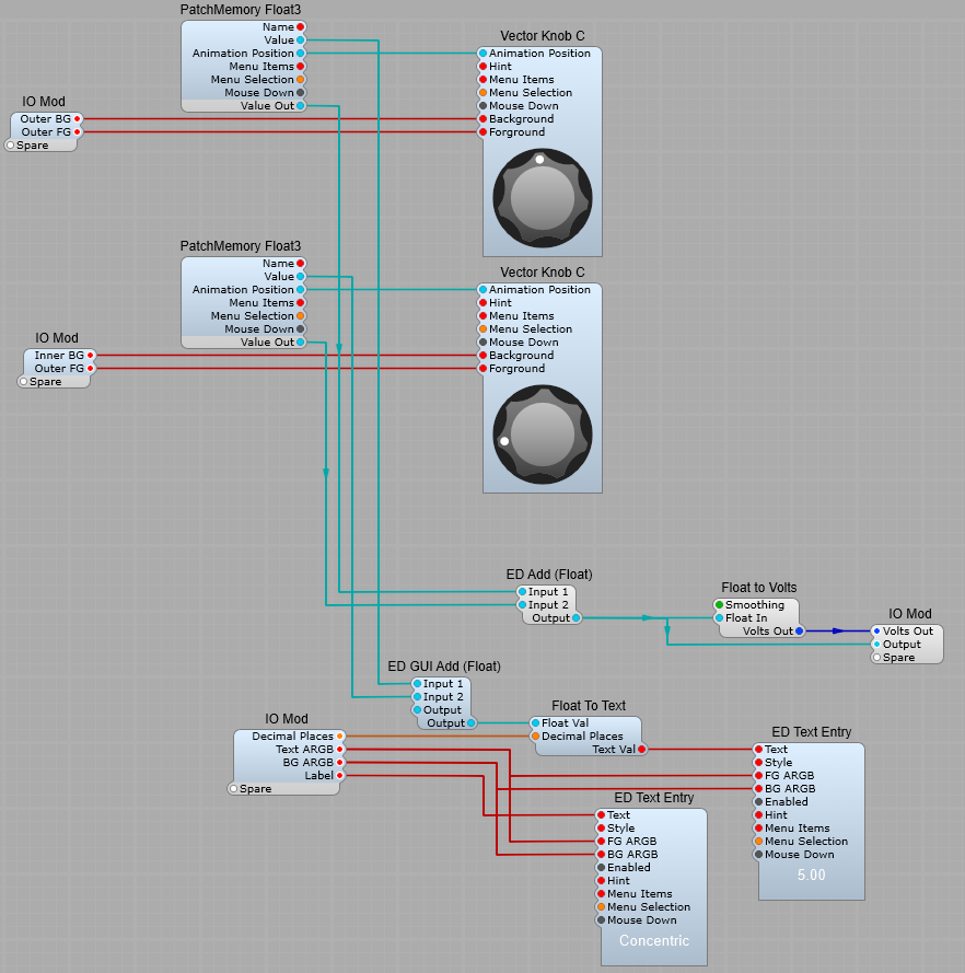
This is a method of creating a combined control for a coarse and fine voltage setting. It’s quite simple and uses the newer Vector controls. This is the finished control (Sorry that flashy looking knob in the centre is V1.5 only but the principle will work with the plain Vector Knob B in V1.4)
How it looks using Vector Knob B in V1.4
This is the structure below (Inside a container). We are just taking the Animation position of each vector control through a PatchMemory Float 3 to convert it to a DSP float value, this will later be converted to Voltage for DSP modules. The PatchMem connected to the vector ring has its maximum value set to 1 so that we get a range of 0 to 1 for this control, and 0 to 10 for the Knob C. The two values are added together using an ED Add (Float) module, and converted to Volts for controlling DSP modules. This means we get a total range of 0 to 11 for the control (shades of Spinal Tap), so by setting the Knob C’s PatchMem to a maximum of 9, we go back to our usual default of 0 to 10 volts. All you need to do once its working is to create a panel view, size and line up the two controls then lock the container view and save as a prefab control. This enables us to use the main inner knob as a coarse 0 to 10 control, and the outer ring as a fine 0 to 1 control (or any range you wish).
Changing the control ranges:
Changing the ranges for the inner and outer controls is as easy as setting the Max and Min values in the properties panel. This is set up for 0-to-1 for the outer ring, and 0-to-9 for the knob, giving an overall range of 0-to10 Volts out.
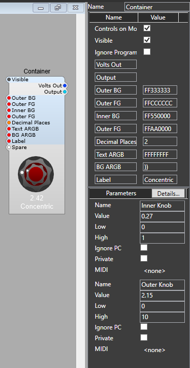
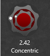
Two similar concentric knobs (V1.5 only)
The principle is similar, however I have added a text readout for the output value, and a text label for the control. Colours of the knobs and the text are editable too.
These modules change the value of a GUI variable. They may or may not also convert the value from one GUI data type to another.
dB to Animation.
This is a module of limited use except in the SynthEdit VU Meter prefab. (“Unfortunately the ‘dB to animation’ module is specific to the SynthEdit VU Meter image, which is copied off real VU Meters and is not any kind of ‘nice’ formula. It can’t be used on meters with a different scale.” Jeff McClintock.)
Float Function.
These modules provide a generic conversion function. Both audio processing and GUI versions are provided.
The supported functions are shown below: *, /, +, -, ^, sin, cos, tan, asin, acos, atan, sinh, cosh, tanh , exp, log, log10, sqrt, floor, ceil, abs, hypot, deg, rad, sgn, min, max. This list applies to both the DSP and GUI modules.
DSP/Audio Float Function
Left Hand Side Plugs: -> A:- (Floating Point) Input value -> Formula: B=:- (Text) Function applied to the signal flow from B to A for example B= A*2 Right Hand Side Plugs: -> B:- (Floating point) Output Value The audio version (as usual) sends data in just one direction. For example to double the amplitude of a ‘float’ signal, open the properties screen, enter the formula – A * 2.
GUI Float Function:
The GUI function module is similar except it works in both directions, so you have two formulae Usually Formula B will be the inverse of Formula A. For example if you wanted a text entry to display a knob’s value as ranging from 1-100, you could enter formula B=A*100, so it follows that Formula B should be the inverse which is B=A/100
Left Hand Side Plugs: ->A:- (Floating Point) Input value ->Formula: A=:- (Text) Function applied to signal flow from A to B ->Formula: B=:- (Text) Function applied to signal flow from B to A Note: If either the A or B function is left as an empty string or the value 0, signal flow from that pin will be disabled. Right Hand Side Plugs: <- B:- (Floating point) Output Value
An example of using these modules is shown below in the SynthEdit VU Meter prefab. We take the Audio input, and feed it into the Volts to Float module where the signal level is converted to floating point at a rate optimised for DSP, which will also give a suitable response time for the meter to be useful (Conversion rate = 60hZ), and the type of response is dB VU to suit a VU meter readout. The next step is to use a PatchMemory Float Out3 to convert the data from Audio/DSP to GUI, and to take the value output (not the Animation Position output) and feed it via the Float Function with these values for the Formulae:
Using these modules.
Formula A= B-18 Formula B= A+18 From here the data is sent via the dB to Animation module to convert the data to fit the scale used for the VU meter, this is where we finally use Animation Position to move the “meter” to the position that matches the Audio input on the VU “scale”. The actual meter we see on the panel uses two Image2 modules. The top one which displays the meter needle is connected to the Animation Position data, and the lower Image has no connections as it’s just the meter scale.
Data Type Conversion Modules
These modules convert from one data type to another, without affecting the value. I’m not including the BLOB datatype converters as this is a rather specialist data format which is used for Audio analysis etc. Bool to Float: Converts a Boolean input to a Floating Point value. For example: False =0, True =10 Bool to Int: Converts a Boolean input to an Integer output. False = 0, True = 1 Bool to Text: Converts a Boolean Input to the equivalent Text string. False = False, True = True. Float to Bool: =<0 = False, >0 =True Float to Double: Converts ordinary 32bit floating Point values to 64bit Floating Point values (Double Precision) Float to Integer: converts the Floating Point input to the nearest whole number. For example a Floating Point value of 3.4 would output Integer 3, and a Floating Point value of 3.6 would result in an Integer output of 4. Float to Text: Converts a Floating point value to a numeric Text string, so 3.1415962 will display these numbers in a text box. The number of digits after the decimal point is set by the Decimal Places plug so with Decimal Places set to 3 the input value will be truncated 3.141. Int to Bool: Converts an Integer input to an Boolean output. 0 = False, 1= True. Int to Float: Converts an Integer value to a Floating Point value (The starting point being Integer the result will obviously be a whole number). Int to Text: Converts an Integer value to a numeric Text string.