This module is one of the essential foundation blocks of any Sub-Control we would wish to make. It can be used to take an image or a series of frames of an image and use them to make a control such as a slider, a knob, an LED/Lamp, a push button, an indicator, a meter or a switch.
The only downside is that the images that can be used being .bmp or .png they are not rescalable. For images to be rescalable they need to be vector of SVG garphics, which are not usable with this module.
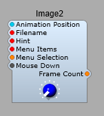
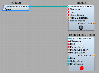
The Image 2 module plugs.
Animation Position:- Selects which frame to display, the value of this is normalized between zero and one. Allows for for animating the image, and for generating a control value from this movement.
Filename:- Enter the filename of the image (.bmp or .png).
Hint: – This text displays as popup yellow tooltip when the mouse hovers over the image. Note: The Hint pin only works for clickable images. So to make the popup hint work for a rotary control, you need to create a basic text file containing – “mouse_response click”, and save it in the default skin folder (you could call it mouse.txt-the name isn’t important though).
Menu Items/Menu Selection – Provides a right-click popup context menu for the image. This is commonly used for adding a MIDI-Learn menu.
Mouse Down:- Provides a bool “True” signal whenever the mouse is clicked on the image, for the duration of the “click”.
Frame Count – Outputs the total number of frames in the image. Used by the Image-To-Frame module.
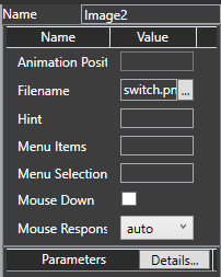
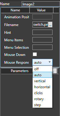
Properties panel.
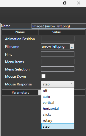
Mouse response allows you to choose how the control interacts with the user:
Off- Disabled, no interaction. Hint popup is not available in this mode.
Auto- Responds to vertical, horizonal step and rotary modes of operation. The hint popup operates in this mode.
Vertical- Only responds to vertical mouse movement. Hint popup is not automatic in this mode.
Horizontal- Only responds to horizontal mouse movement. Hint popup is not automatic in this mode.
Clicks- Responds to a mouse down event on the the control. The control goes to the 1 position. A button is non-latching in this mode.
Rotary- Responds like a rotary control. Hint popup is not automatic in this mode.
Step- A rotary control moves in steps of 0.1. A button latches in the on or off position when clicked (depending on it’s current state).
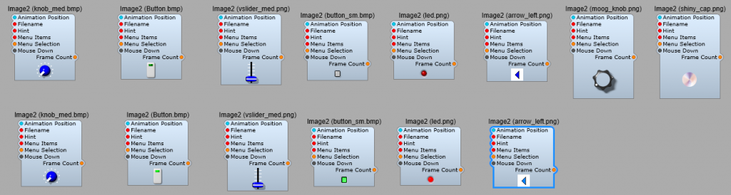
The stock SynthEdit image files.
The file names are shown in brackets after the module name.
By deafult these images are located in (For Windows, Not being a MAC user I don’t know their default location) C:\Users\Public\Documents\SynthEdit Projects\skins\default2.
How the image file is animated.
The Bitmap Image sub-control lets you use multiple-frame .bmp or .png images as controls. You have used them and seen them in action but here is a basic overview of what you need to know (as far as a non-programmer).
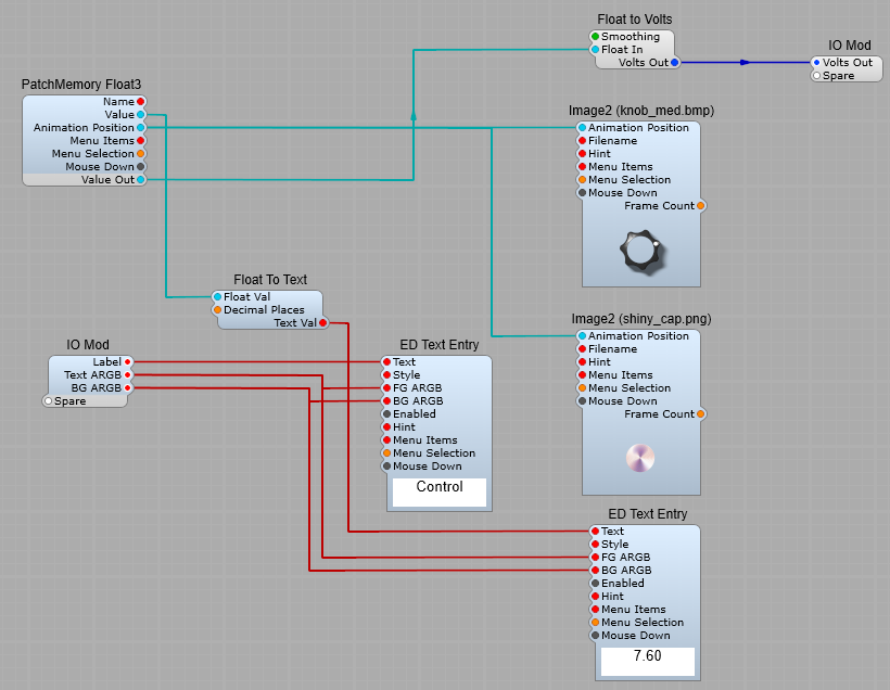
This image is made up of 40 images known as “frames”, which means the animation runs very smoothly. In the skins default folder there is a text file referenced by the Moog control knob, this is the moog_knob.txt file, and this is what it contains:
moog_knob.txttype animated (Tells Image2 that the control is meant to move)frame_size 48, 45 (The size of the image file in pixels)mouse_response rotary (The control rotates)padding 13, 7, 13, 4 (The amount of space (padding) to allow round the knob.
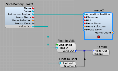
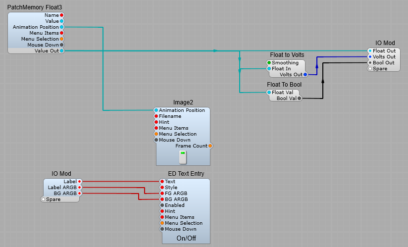
As the image rotates the position of the knob image is converted to a float value. In the structure in figure below, a PatchMemory Float3 and a Float to Volts converter convert the image’s Animation Position to a voltage output.
Any multi-frame image can be used in this way to create visual controls such as buttons, switches, knobs and sliders.
Using the “Moog” Knob.
The two Image2 modules are linked so that the shiny cap will rotate with the knob. Animation position is also fed to the PatchMemory Float3 module, and converted to a DSP signal> this is converted from Float to Volts, any steps or jerkiness is smoothed out, and output at the IO module.
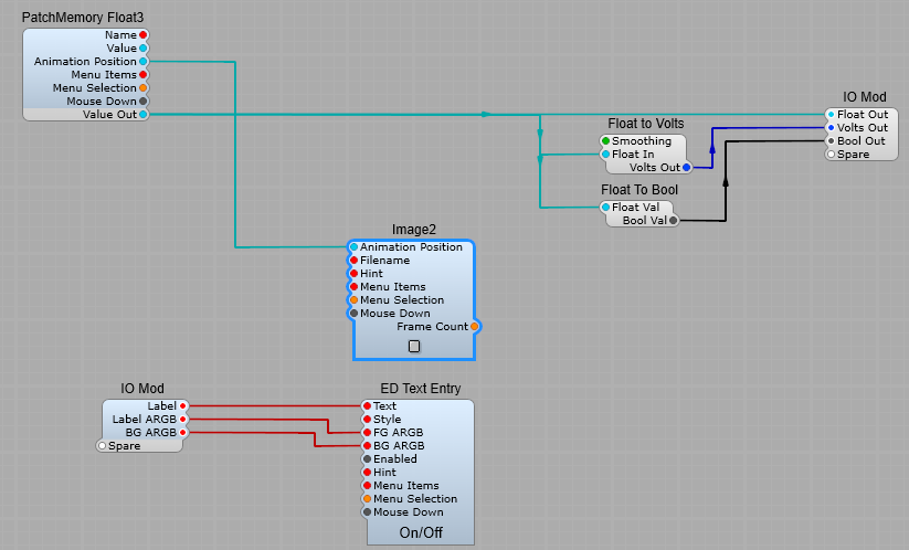
Hint: Make sure that both Image2 modules have their Mouse Response properties set the same, otherwise the two different rotations can look a little odd.
Hint: Sometimes you will want this control to send information to another GUI external module or prefab. In this case always make a connection from either the Animation position or GUI Value plugs on the IO Module. Don’t waste resources by converting the DSP Voltage back to GUI Float again.
Hint: When you connect up a Text Entry module for a label for the control it’s a good move to connect the Text input to an IO module (you won’t have to keep opening up the module to change the label, unlike the stock Moog knob prefab).
Creating a slider control.
This uses the vslider_med.png image, and the vslider_med.txt information file the contents of which are shown below;type slider
frame_size 28, 40
handle_rect 4, 41, 28, 55
handle_range 1, 26
orientation vertical
For this control you can leave the mouse response setting as Auto- we don’t want to change this.
Creating a Button type switch control.
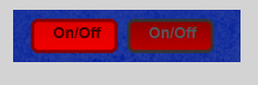
Here the image of a button has just two “frames”, for it’s “on” and “off” states.
Click on the ellipsis by the filename box in the properties and find the button.bmp file, and load it into the module.
The text file associated is quite simple, and needs no alteration.type animated.
frame_size 18, 30
mouse_response click
To change the mouse response for our prefab, you can do this from the Image2 properties, go to the MouseResponse List. Auto or Clicks will give you a momentary switch, Step a latching switch. Vertical, Horizontal or Rotary will work, and give you a Latching button, but I would really discourage doing this as it’s going to confuse your VST’s users.
Or you can use button_sm.png
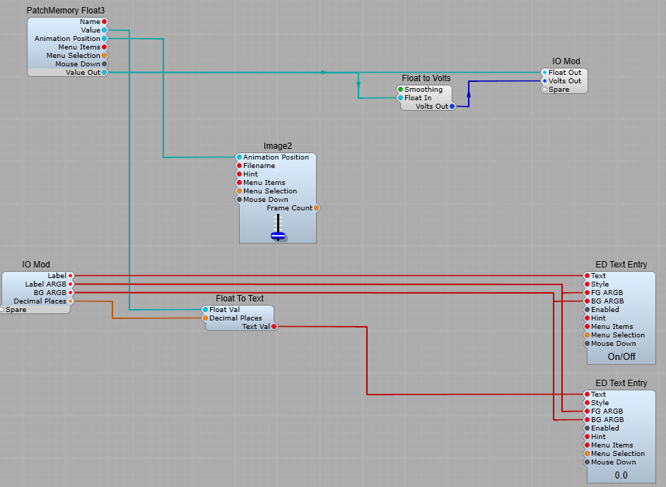
Creating your own On/Off Switch.
The same principles apply to creating your own on/off switch.
Click on the ellipsis by the filename box in the properties and find the switch.png file, and load it into the module.
This is the switch.txt file associated with it (I’m just showing you this for reference)- SynthEdit automatically reads this file.; medium vertical slider
type animated
orientation vert
frame_size 25, 26
; extra space at: top, bottom, left, right
padding 5, 2, 5, 3
mouse_response stepped
You can see it’s quite different (the lines with the semi-colons are just comments-not read or used by SE) from the moog_knob file. For a start the orientation is vertical, not a rotary control, and that extra line at the end mouse-response stepped means that when you click on the control it stays in it’s new state until you click on it again.
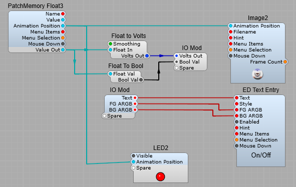
In this application the Animation position does not change value gradually with control position, it has just an on and an off state, with a float value of 1=on, and 0=off.
The observant among you will notice I have connected the LED prefab directly to the Animation Position…but the LED prefab has a DSP Plug. I took out the conversion modules and connected directly to the Image2 module in the LED prefab (saving on un-ncessary DSP-GUI conversions). So we now have a switch with a label and on/off LED indicator.
Hint: So you need a non-latching (momentary) switch?
Thats easily done, click on the Image2, and in the properties panel click on the Mouse Response list, and change from Auto, to Clicks. Now your switch won’t stay in the same position, it will “flip” back to it’s default off position.
Hint: If you leave the Mouse Response as Auto then it will use the setting in the associated text file. If you select anything but Auto from the list, this will over-ride the setting in the text file.
Small Illuminated Push-Button.
A simple little prefab that gives a small circular illuminating push button switch. Look for the image file Led.png in the ususal way, and select either clicks for a momentary switch action, or step for a toggled (locking) button.