Updated & expanded 12/11/2025.
About the SVG Controls.
I am maintaining the pages on the SVG controls for those that already have these controls, but sadly Sasha deleted his website and appears to have left the SE community, so they are no longer available (one reason being that they were paid for, not free modules). Whether Sasha will return to the SE community no one knows, as we have been unable to contact him.
Unfortunately I am unable to provide any more assistance with these modules than the basics I have given here.
These controls have two main advantages:
1) They can be re-sized with no loss of quality.
2) Highly customizable.
The basic set of controls is shown below.
Making the controls your own.
Lots of options here but I would suggest that you create these controls in containers, and link only the plugs you know you will use through IO modules.

The Help Files.
s SVG Control:
This is the module on which all the SVG controls can be created. It displays SVG files and makes them interactive by using @commands, and animation
Filename: (Text) Supplies the SVG file path.
Important Note: If you are finding that when you select a new file name you get a “broken” control that has no image, then your SVG files need to be copied into the Skins/Default folder. Leave the originals in the folders as they are, just copy the folders and their contents.
The reason for this is that SE “assumes” that the files will be in the Default Skins folder, and SE offers no way to change this.
Animation X/Y: (Floating Point) These plugs send and receive (exactly as the default SE controls) the horizontal (X) and vertical (Y) animation position of the control as a GUI Float value between 0 and 1.
Modulation Value: (Floating Point) The input plug for animation modulation. This animates each layer which name contains the “@modulate” command with the modulation value. This must be connect to a Patch Memory Float Out’s Value pin. Input is scaled so that 0-10 corresponds to the default of 0-1.
List Choice: (Integer) Sends and receives index value of the selected List Item as with other SynthEdit sub-controls.
List Items: (Text) Input for the list of items. Any input other than blank makes module the operate in a stepped mode, a blank input allows for a
continuous (un-stepped) movement of the control. A single item input makes the module operate in trigger (on-off) mode. Each list item’s text will replace the “@item” text in the SVG file.
Note: For the stepped option to operate correctly there must be the same number of List items as there are list choices. Important: the Integer list for choices must start at 0, not 1 if there are 5 List Items, then the List Choice shall be 0,1,2,3,4.
Mouse Down (X/Y): (Boolean) Outputs mouse pressed state.
@image: (Text) Supplies the bitmap file path. The Bitmap is displayed on a rectangle in the layer name (in the SVG file) which contains the “@image” command.
@label: (Text) Inputs the text string which is used for replacing the “@label” text in the SVG file.
@value: (Text) Input to supply the value text. This is used for replacing the “@value” text in the SVG file when the mouse pointer is over the control. Note about Hover: For the @value text to be visible the Opacity Normal value in the s SVG Control’s properties must be set to 0.
All Color plugs: How to specify the colours- This is either standard HTML colour names (i.e. Red, Orange, Yellow…), or hex color codes in the following formats: #RGB, #ARGB, #RRGGBB, #AARRGGBB.
@color: (Text) Input for the main control colour.
Cap: (Text) Input for the colour of the cap on the control knob.
Neon: (Text) Input for the hover text colour, and the “slot” for the slider control.
Pointer: (Text) Input for the colour of the pointer control knob.
Print: (Text) Input for the default text and scale colours.
Hint: (Text) Input for hint text (mouse hover)
Menu Items: (Text) Input for context menu items
Menu Selection: (Integer) Outputs the context menus item index value.
Position (X/Y): (Floating Point) Outputs the mouse pointers horizontal (X) and/or vertical (Y) position in the normalized floating point range (0.0 to 1.0)
Mouse Over: (Boolean) Outputs the mouse hover state.
Additional settings found in the Properties Panel.
Mode; (Drop down list)
1) Control: Normal operating mode. Module responds to mouse events and animation inputs.
2) Read-Only: Module operates in display mode, useful for LEDs and meters
3) Click-Through: Module will pass all mouse events to modules below. Useful for decorative elements, like glass reflections or coloring of jack inputs/outputs
Mouse Precision: This defines the precision of mouse movement in pixels. If zero, precision will be equal to the current @range setting.
Fine FactorMouse Precision will be scaled by factor when CTRL key is pressed
Jump to Mouse: The Animation Position jumps to the pointer location when the left mouse button is pressed
Anim to Choice: If the module is operating as stepped, this sets which axis will be used to control the List Choice by using the animation position (X or Y).
Scale: Scales the whole graphic proportionally (1.0 = 100%). Note: values greater than 1 can be used.
Angle: This offsets center angle used by the @rotate command. Leave this setting blank to use the default value
Sweep Angle: Defines the amount of rotation that is used by the @rotate command (the knob control for example has a setting of 300) which gives the normal amount of rotation, reducing that to 150 give a rotation from 90 degrees to 180 degrees taking 0 degrees to be at the bottom of the control.
Opacity: Normal/Hover/Pressed Defines the amount of opacity used by the @show and @hide commands. @show command uses opacity values as they are, while the @hide command subtructs opacity values from 1.0
Note: Hover state is available only in SE 1.5 and above.
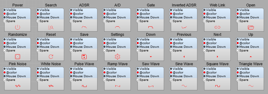
The control modules:
Note: The VU meter and PPM meter will only respond to an input signal when the audio engine is running.

These Icon symbols are also available.
s SVG Control: @commands
Add interactivity and animation to SVG files using @commands. Commands can be issued by naming layers inside a vector graphics editor (i.e. Adobe Illustrator, Figma, Inkscape), or via the id parameter of SVG tags (shape id=”@command”) using a text editor (i.e. Notepad)
Below is the list of the supported commands
Transformation
Add movement to shapes in response to mouse motion
@move: Allows you to move an object horizontally and/or vertically within a specified range.
@follow: Makes an object follow the mouse pointer horizontally and/or vertically within a specified range.
@scale: Scales an object horizontally and/or vertically in relation to a specified origin point.
@flip: Flips an object horizontally and/or vertically in relation to a specified origin point.
@rotate: Rotates an object around a specified origin point. The sweep angle is specified in the properties panel.
@rotateS: Similar to @rotate, but only the shape will be rotated while its gradient fill will remain static.
Transformation Modifiers
Limit a transformation to a single axis, modulate transformation, or make a shape react in reverse to the mouse movement
@X: Limits the object’s transformation to horizontal movement. i.e. @moveX. Not available for rotation.
@YLimits the object’s transformation to vertical movement. i.e. @moveY. Not available for rotation.
@modulate: Transformation will be modulated by the signal connected to the Modulation Value plug.
@reverse: Applies a transformation in the opposite direction to that of the mouse movement.
Transformation Helper Objects
Easily change transformation parameters (origin and/or range) by drawing helper objects. Only their position and/or size will be used to set the parameters, but they will not be displayed in SynthEdit (SE).
@origin: Transforms a circle into an origin point for rotation, scale, or flip transformation. If more than one origin point is defined, only the last parsed will be used. If not specified, the center of the module will be used as the origin
@range: Transforms a rectangle into a range used by follow or move transformations. If more than one range area is defined, only the last parsed will be used. If not specified, the whole area of the module will be used as the range
Appearance
Change the appearance of shapes fast and easily
@color: Changes the color of an object to the one specified in the properties panel. If no layer contains this command, all layers will be recolored. Useful for fast recoloring of icons inside SE. The “@color” field accepts standard CSS color names (i.e Red, Orange, Yellow…) and hex color codes (#RGB, #ARGB, #RRGGBB, #AARRGGBB)
@color + (Cap, Neon, Pointer, or Print): Assigns additional colors to the appropriate plugs. This is very useful for making UI color themes
@show: Changes the opacity of an object based on the mouse state (normal, hover, and pressed). Opacity values used for each state are specified in the properties panel. If no layer contains this command, all layers will change their opacity in regard to the mouse state
@hide: Similar to “@show”, but in reverse
Text
Swap labels or display values inside SE
@label: Allows you to easily change a label text in SE via a plug.
@value: Allows you to easily change a value text in SE via a pin.
@item: Automatically replaces all the “@item” texts to appropriate List Item names. Useful for switches and selectors
Text Modifiers
Modify text alignement. Text is aligned centrally by default
@L: Aligns text to the left. i.e. @labelL
@R: Aligns text to the right. i.e. @labelLY
Special Objects
Transform simple shapes into objects that are common in audio plugin UI design
@image: Transforms a rectangle into an image frame. The image link to a bitmap file is specified in the properties panel. Useful for applying transformations to bitmaps or adding textures to otherwise flat vector shapes
@ring: Transforms a circle into a modulation ring track. The sweep angle is specified in the properties panel
@ringFill: Transforms a circle into an animated modulation ring fill.
@ring: FillBTransforms a circle into an animated bidirectional modulation ring fill.


